In lieu of completing a work placement in my third year (due to scheduling conflicts with my job) I decided to work on some client projects. One project I completed over the summer, which was designing and developing the branding for a radio charity event. The other project was a cover for a book titled ‘lost fragments of the soul’, which was picked from a list of client projects provided by the university. I chose the book cover client project as I hadn’t designed one before and it differed from the website I had created over the summer.
Completing a placement was difficult for me as it conflicted with my work schedule for my job. Instead, I decided to choose a client project from the list the university provided. This project piqued my interest as I had never created a book cover before, and I saw it as an opportunity to learn some new skills and challenge myself. Creating a book cover interested me as I could use the synopsis and title to influence the design. My plan was to create several sketches and explore which idea worked the best for the title.
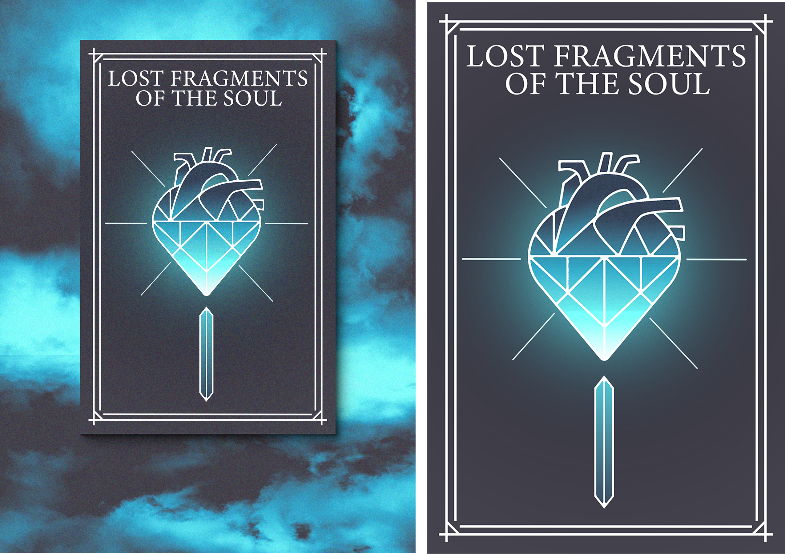
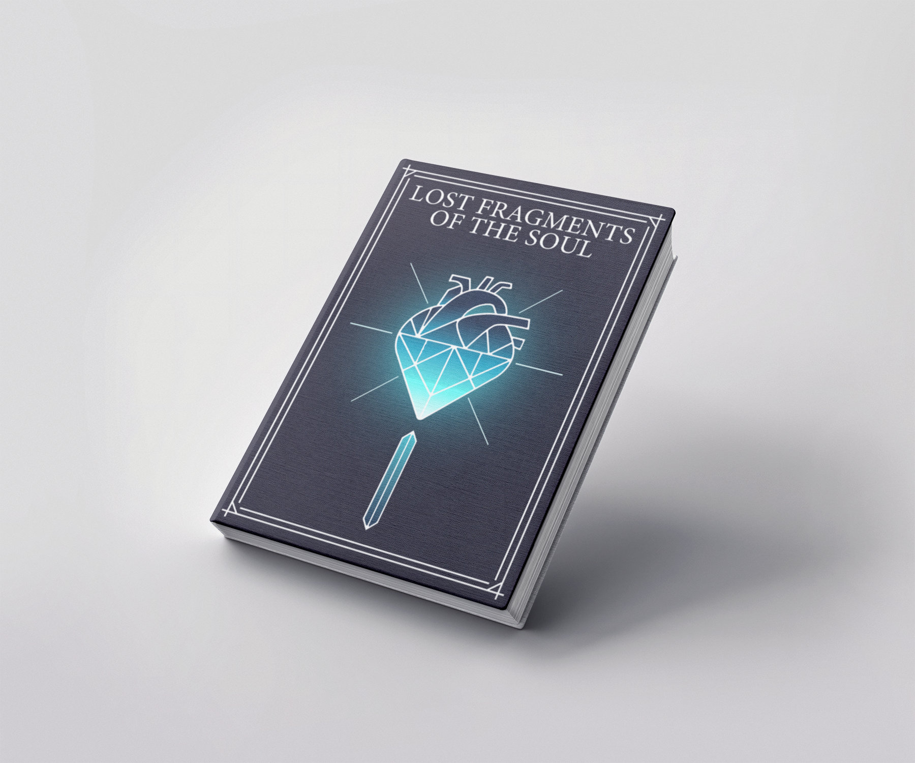
The brief stated that a book cover would need to be created, as well as an advertising poster. I wanted the designs to be similar in order to create some brand synergy for the book. The client required the cover to fit the content of the book. As the synopsis of the book was included in the brief, this could be used to better understand the style of the book and which type of design would fit (I opted for a minimal design so that it would stand out on a bookshelf). The brief mentioned that there was information and visual ideas for each character that could be used as part of the design for the book cover. Ultimately, I decided not to include the characters on the book cover so the book would look different from others in its genre. Upon conducting research on similar novels, I found that most of them all featured the same art style with similar looking characters. For the advertising poster, I decided to feature the book cover applied to a mock-up book, and then create a background gradient that helped the book to stand out. Both deliverables needed to be ready for print, so it was important that the resolution for both designs was sufficient.
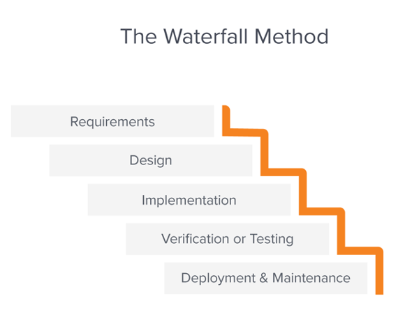
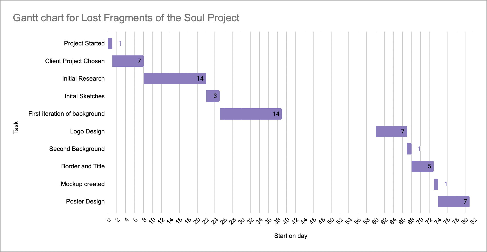
Communication for this project was difficult, which meant my project methodology defaulted to the Waterfall method. This methodology was invented by Dr. Winston W. Royce in the 1970s and involves developing a project in an incremental process. In the context of the book cover, this meant I would need to complete my sketches and could not begin the actual design until I had settled on my preferred idea. I would then need to complete the actual design fully before delivering it to the client. This is not how I would usually complete a project, but by the time I had reached a stage where communication with the client was necessary, they were unavailable. This meant I could only create the design based of the contents of the brief, and not gain feedback on my design until the end of the project. Had my communication with the client had been better, I would have opted for an Agile or RAD methodology, as these work better for me when completing client projects. Despite this, utilising the Waterfall methodology did provide some advantages. As the process was very linear, I could plan out exact deadlines for myself on completing different parts of the project, which improved my time management greatly. This does also impact the flexibility of the project. If the client did not like my design, I would likely have to start from scratch.
During this project, it became apparent that I would need to learn how to use Adobe Illustrator to create elements for the design. I have intended to learn Illustrator (and more specifically the pen tool) for a very long time, and this provided the perfect opportunity for me to do so. I found a very useful YouTube tutorial on how to use the many different versions of the pen tool which acted as the kick-starter for learning how to use the application. Once I understood the basics, I became more comfortable with the software every time I used it. As I am very familiar with Adobe Photoshop, the similar user interface and toolset made learning Illustrator far easier. While I am definitely better with Illustrator, I only used the software to create shapes and not much else. I intend to continue to learn different aspects of Illustrator as the application is essential for the type of designs I would like to create in the future. As Adobe applications have their own ecosystem, I also benefitted from seamlessly moving designs between Illustrator and Photoshop. This was my first time using both applications for one design, and it proved to be very efficient and easy to do.
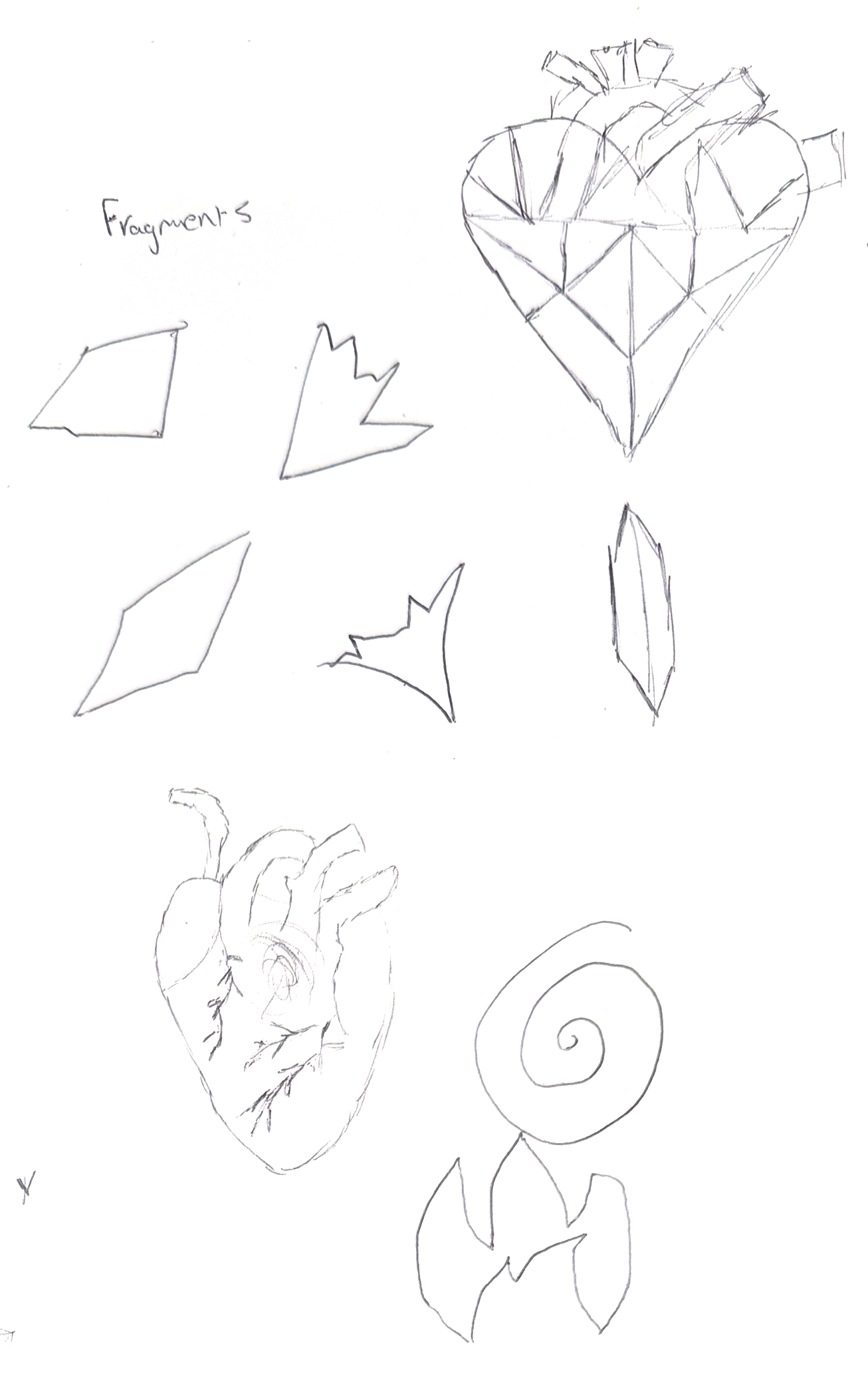
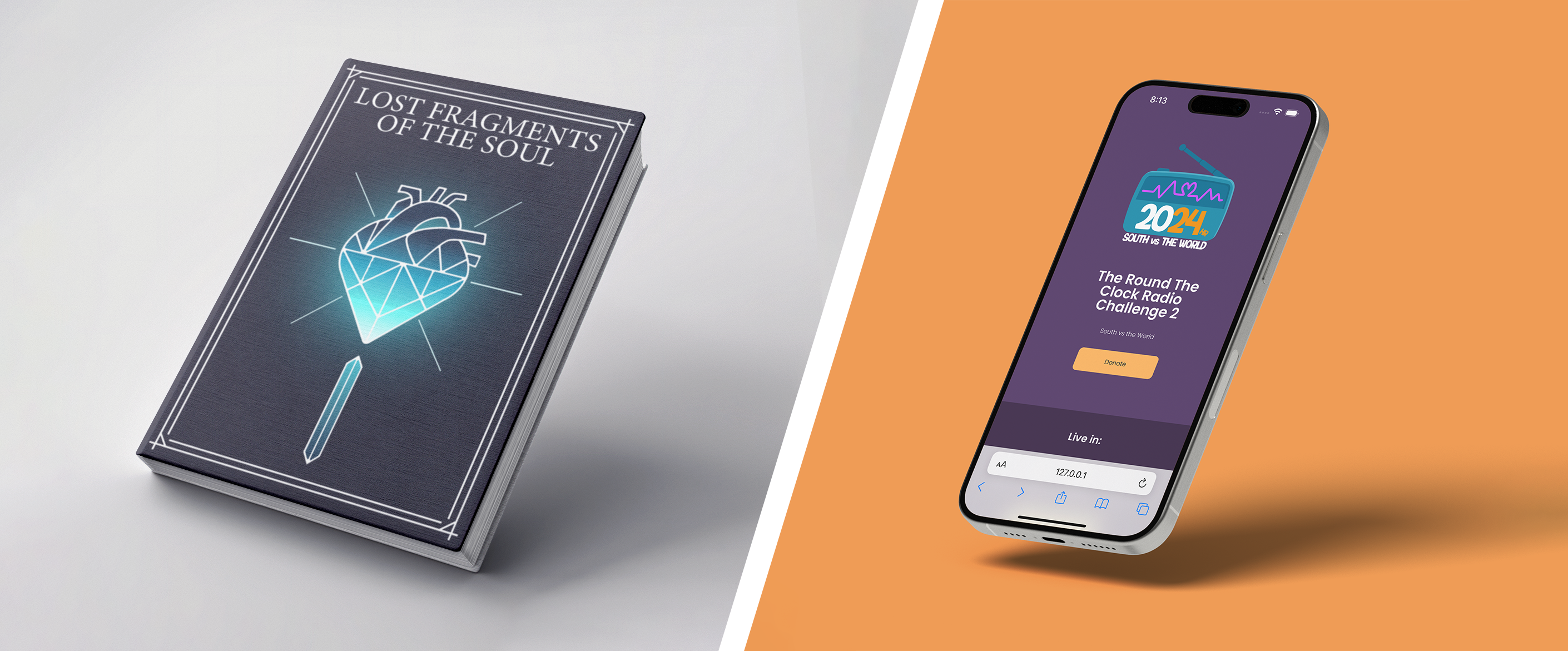
To begin the project, I thought about what could represent the ‘soul’ in my design. A quickly became apparent that a universal representation of the soul was a heart. During my sketches, I tried drawing simplistic cartoon hearts, as well as realistic ones. Neither fitted the style I was going for, so I decided to try merging the two to see how it looked. I found this to be a unique design, and liked how it looked, so this is what I chose to be the centrepiece of the book cover. For the background, my first iteration featured an ocean that seamlessly transitioned into deep space, that was densely populated with stars and galaxies. I went through many versions of this idea but could not get it to look as I wanted. The book cover looked too complicated, and I feared potential customers may overlook the book as it was too cluttered and did not stand out. Eventually, I decided to make the design more minimal, opting for the heart to be the key element to the cover. To design the heart, I used Illustrator and began my making a perfectly symmetrical heart with the pen tool. I then used a real picture of a heart as reference to add arteries and aortas to the top. Originally the heart I made was too short and it did not fit on the cover, so I decided to extend it vertically and make the heart asymmetrical.

After completing the heart design in Illustrator, I pulled the asset into Photoshop to add it to the book cover. The background I had chosen was a desaturated purple colour, so to make the heart stand out I added a vibrant blue gradient, as well as the bright blue glow behind it. I also added a border to close off the design, as the cover looked bland without it. For the title, I chose the ‘Minion variable concept’ font, as it is legible from a good distance and stands out on the design. The font is also highly customizable, as you can change the font weight and optical size. For the poster, I used a mock-up template from a website called ‘mockupworld’ to apply my design to a book. I then created a gradient behind the original design. To ensure the book stood out, I used bright colours that went against the desaturated purple of the cover.
The communication for this project was something I struggled with the most. As I prioritised work on other modules before this client project, it meant I did not require any communication with the client for the first half of the semester. By the time I had started my work, the client had gone on leave, and I was unable to contact them. It was for this reason that I changed my project methodology from agile to waterfall and completed the book cover in its entirety before sending it to the client. While I am unable to contact the client until after the project deadline, I did send my book cover design to one of my university lecturers for feedback. He liked the design very much but stated that since I could not contact the client, I could have created two or three designs with varying colour schemes and font choices so that the client would be able to choose the design that they preferred; I could then fully develop this design and get it ready for print. Due to time constraints, I was unable to create more than one design for this project. If I were to conduct the client project again, I would use the feedback from my lecturer and create multiple designs for increased flexibility.
Due to my current job, I was unable to complete a placement. Instead of this, when the list of client projects was issued by the university, I considered each client brief and eventually decided on creating the book cover and advertising poster. For the first few weeks of the project, I conducted research on book covers belonging to the fantasy genre, to gain inspiration for my own. I then quickly made many sketches to decide on how I wanted my cover to look. At this point in the project, I had decided what I wanted the book cover to look like, but I began to prioritize the other modules I was working on simultaneously. My business plan required a lot of work as I kept switching what ideas I wanted to do. As a result, I struggled to work on this project regularly until the second half of the semester. My time management improved in the latter half of the semester, and I was able to work on all 3 modules simultaneously. By consistently working on each project, I found my work improved as ideas I had stayed fresh in my mind. As I struggled with communication for this client project, I ran out of time to create further iterations of the book cover and advertising poster, which slightly hindered my progress. If I had managed my time better in the first half of the semester, I would likely have had more time to finalize the designs, as well as being able to communicate with the client (who was unavailable in the later stages of the project).
During this project, I found that the design process went very smoothly. The research I conducted influenced my sketches, subsequently ensuring the design I chose to develop was sufficiently on theme. When it came to producing the final design, I had ensured every part of the book cover was editable so that I could go back and tweak anything I needed to. This modular workflow proved beneficial as I would need to resize certain assets, so they fit the dimensions of different book sizes. Another part of the project that went well was developing the poster, as I had a clear idea of what it should look like and could infer from research that my design fit the genre of the novel.
Adversely, my time management and communication for this project could have been far better. When I complete projects, I prefer to focus on one project at a time so I can focus solely on one idea; I typically find this to be more efficient than switching between different projects simultaneously. Throughout my time at university, I have realised the benefits of being able to work on all projects equally at the same time. By doing this, I am less likely to get stuck and halt all work progress. This is still a skill I am looking to develop as being able to work on multiple projects at once will be particularly useful after university. In terms of communication, consistent communication with the client was unavailable, and some reasons for this were out of my control. Regardless of this, putting a contingent plan in place for this would have proved beneficial. In the later stages of the project, I gained feedback from one of my course leaders that suggested I could have made multiple iterations of the book cover to present to the client at the end of the project. By doing this I could have presented them with a choice instead of a single design which they may or may not like.
This project was designed entirely in Adobe Photoshop and Adobe Illustrator. In previous designs I have exclusively used Photoshop, even for creating logos. The disadvantage to this is that Photoshop is a raster-based software, which can lead to issues when printing if the document is not set up correctly. On the other hand, Illustrator is a vector-based software, which does not rely on pixels and instead uses mathematical formula to determine the design. This is highly beneficial as a vector-based image can be resized without loss of quality. Illustrator is also far better suited for creating shapes and the like thanks to its well-suited pen tool. By designing entirely in Adobe apps, I could also utilise the platform’s eco-system, which makes transferring designs from software to software much more efficient and easier.
To summarise, I found this project to be refreshing, and also interesting to design a book cover, which I had not previously done. The strongest aspect of the project was the design process and the final design. I successfully created a cohesive book cover and poster that fit the genre and client brief. Additionally, learning the pen tool in Adobe Illustrator helped to expand my designing capabilities, and will allow to make higher quality and more professional designs in the future. The biggest area for improvement was time management and communication, which I intend to improve in my second semester. Being able to adapt to a different project methodology was important, as utilising a linear workflow allowed me to continue to work on the project. The main takeaways from this project are to consider communication more closely, and to ensure that I can work on multiple projects simultaneously without prioritizing one over the other. With every project, I reinforce and improve my digital design ability, as well as improving my soft skills.
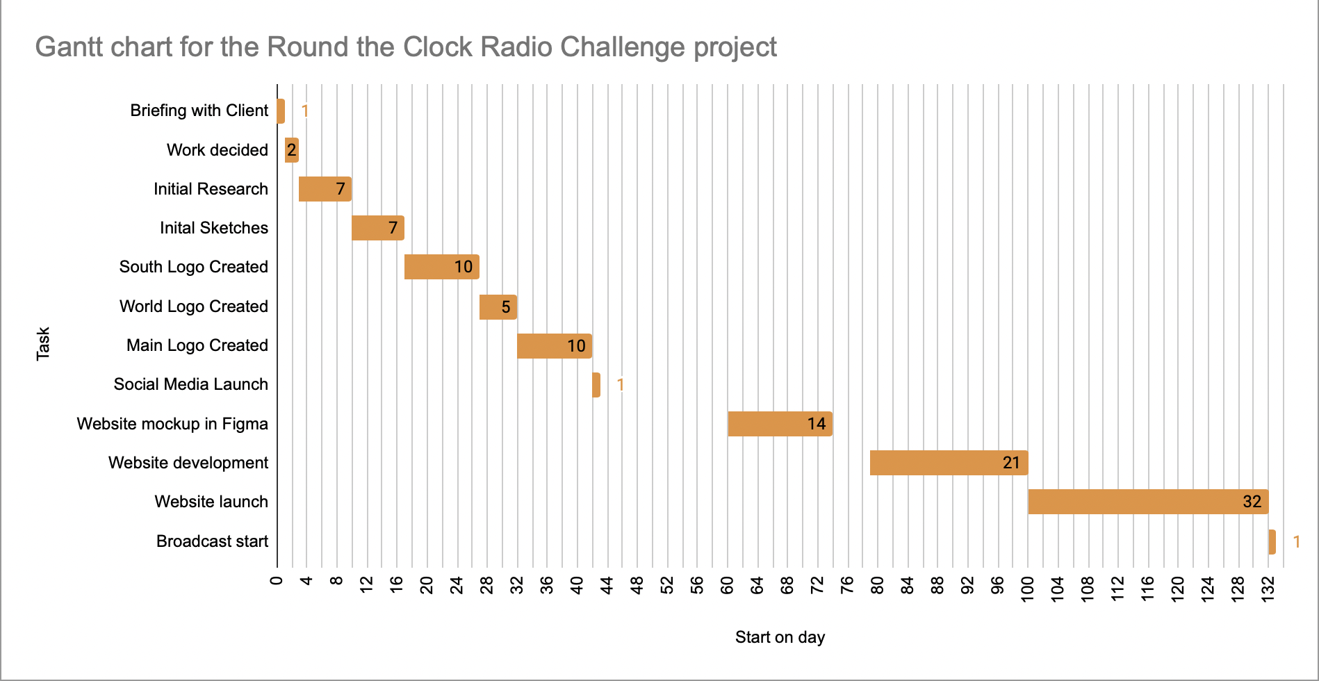
The round the clock radio challenge is an annual event where the student radio stations in the south join together for charity. They host a 24-hour radio broadcast with special guests, quizzes and music to raise money for multiple charities. For this year, my friend was in charge of managing and producing the event and enlisted the help of my brother and I to create all the branding and the website. Being able to create all the designs presented a valuable opportunity as I could create a cohesive brand that all followed the same colour scheme. Prior to this project, I had completed projects for external clients that were not attached to the university, albeit on a smaller scale (social media posts, small logos etc.). This project was far larger, and would require careful planning, as well as consistent communication with the client to ensure all deliverables were acceptable.
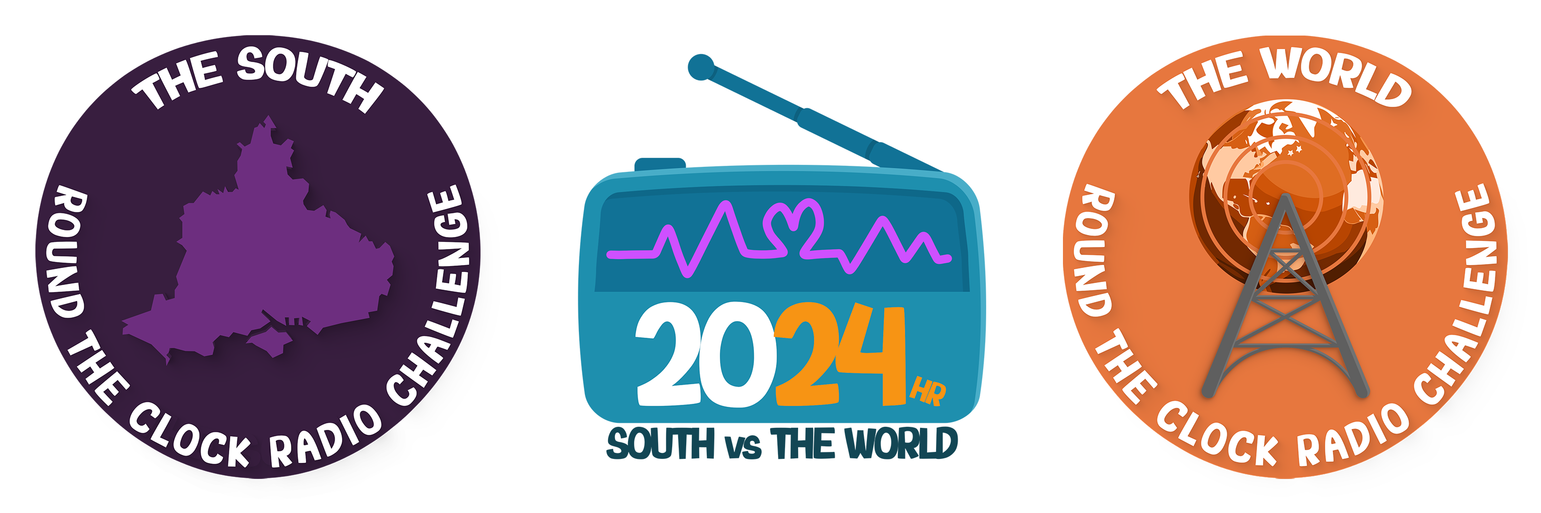
To begin the project, my brother and I sat down with the producer to discuss everything that needed to be created for the event, as well as colour schemes, fonts, deadlines and details on the charities and associations involved. For this year, the radio charity event initially had a theme, which was ‘South VS the World’. The main idea behind this was that since the event was being hosted by all the student radio stations in the south, they would have guests from other parts of the UK (and internationally) to compete in friendly contests and the like. As a result, 3 logos would need to be created: A main logo to be used for the entire event, a logo for the south, and a logo for the world. As well as this, there needed to be a social media account created and managed, and a website that would feature all the key information for the event. There were two deadlines for this project, as the logos needed to be created before the social media could launch months prior to the event taking place. The website then needed to be completed and made live a month before.
Once we had collected all the information we needed in order to complete the project, we decided that I would create the logos and the website, and my brother would manage the social media. During the brief, the producer had told us that he would like 2 different colour schemes for each team (the south and the world). The south colour scheme was orange, and the world colour scheme was purple. My aim was to make the brand of the event cohesive, so these colour schemes would influence the design of the main logo and the website. My main objective for the website was a sleek, simplistic design that would provide all the essential info for the event clearly. I also wanted the website to work on any device. Since I was working with my brother, we needed to ensure there was consistent communication to ensure that our designs were cohesive. I needed to create the logos first so that they could be featured on the social media as soon as it launched, in order to create a brand identity.
For this project, I decided to employ the Agile project methodology. This project methodology prioritizes collaboration between the designers and the client, over following a specific plan from the beginning. The core advantages of this are that the planning phase is a lot shorter, and the client receives more frequent updates on the progress. By communicating more with the client, they can also add more input to the designs to ensure the project is completed to their liking. As we had gained all the core information we needed to begin designing in the initial briefing, I could begin work on the logos and collaborate with the producer of the event until the logos were satisfactory. When producing a project using agile, the pace of development should be consistent throughout, which requires exemplary time management. Furthermore, agile allows designers to be more creative, since the planning stage is short, and iterations of the designs are created right from the beginning. One small disadvantage of agile is that planning how long each step of the process may take can be difficult, since the client may require a lot of changes to be satisfied. In order to combat this, it is vital to add buffer time to the project, to ensure there is more time available to complete the project if needed.
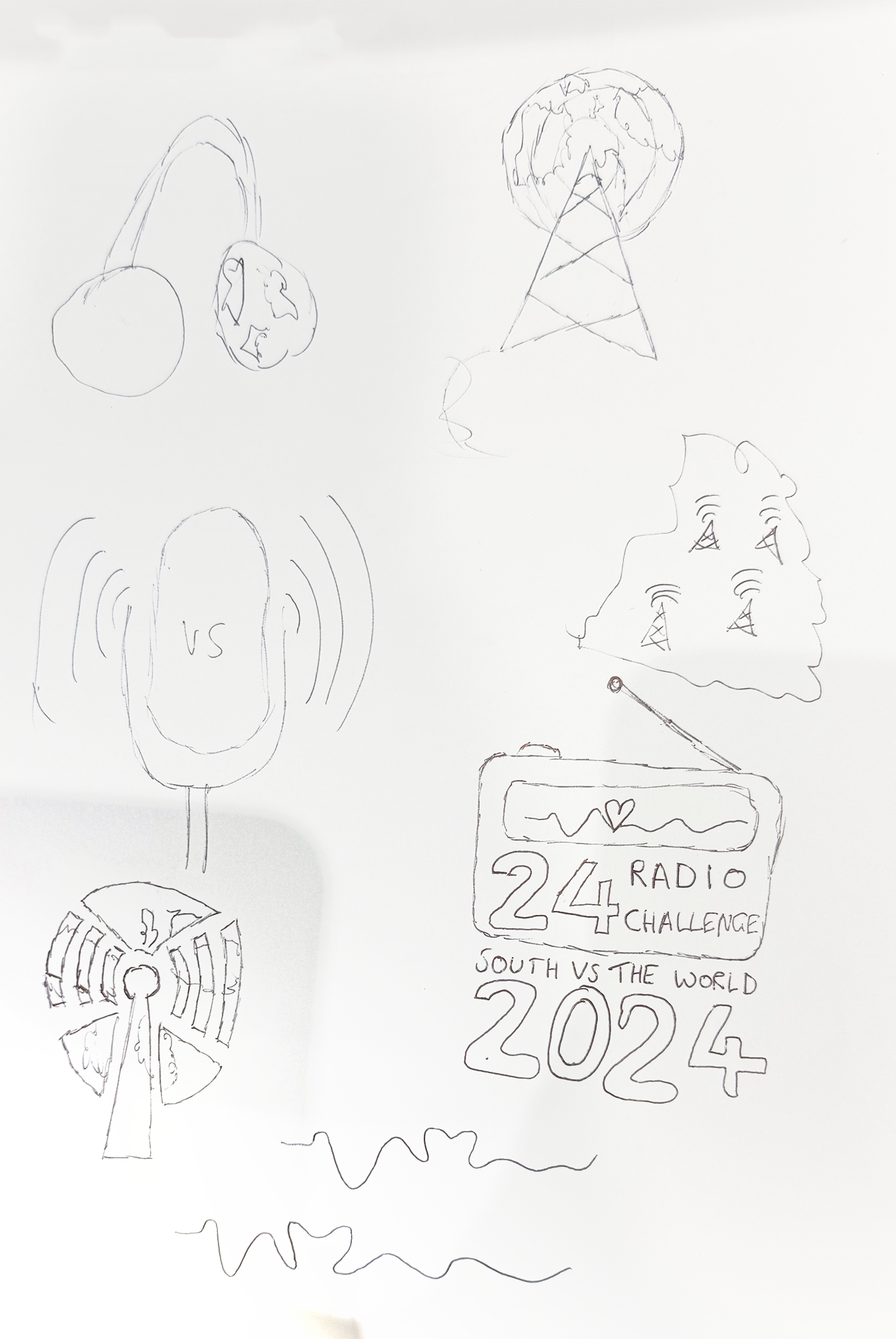
To begin the design process for the logos, I considered how I could portray the fact that the logos were for different teams. My immediate idea was to create logos that were similar to football club logos, as this is an idea that is familiar to a lot of people. A football club logo typically has a symbol in the centre, with text in a circle around the outside. I also needed to consider the colour of each logo to fit the brief outlined by the producer of the event. For each logo, I decided to feature a key symbol of what each logo represented, to make them easily identifiable. This meant the main logo contained a radio, the world logo featured the globe, and the south logo featured an outline of the south of the UK. For the main logo, it was important to use colours from each of the other two logos to create brand synergy. Throughout the development of each logo, I would regularly contact the producer of the event to update him of my progress, and to gain feedback on the designs.
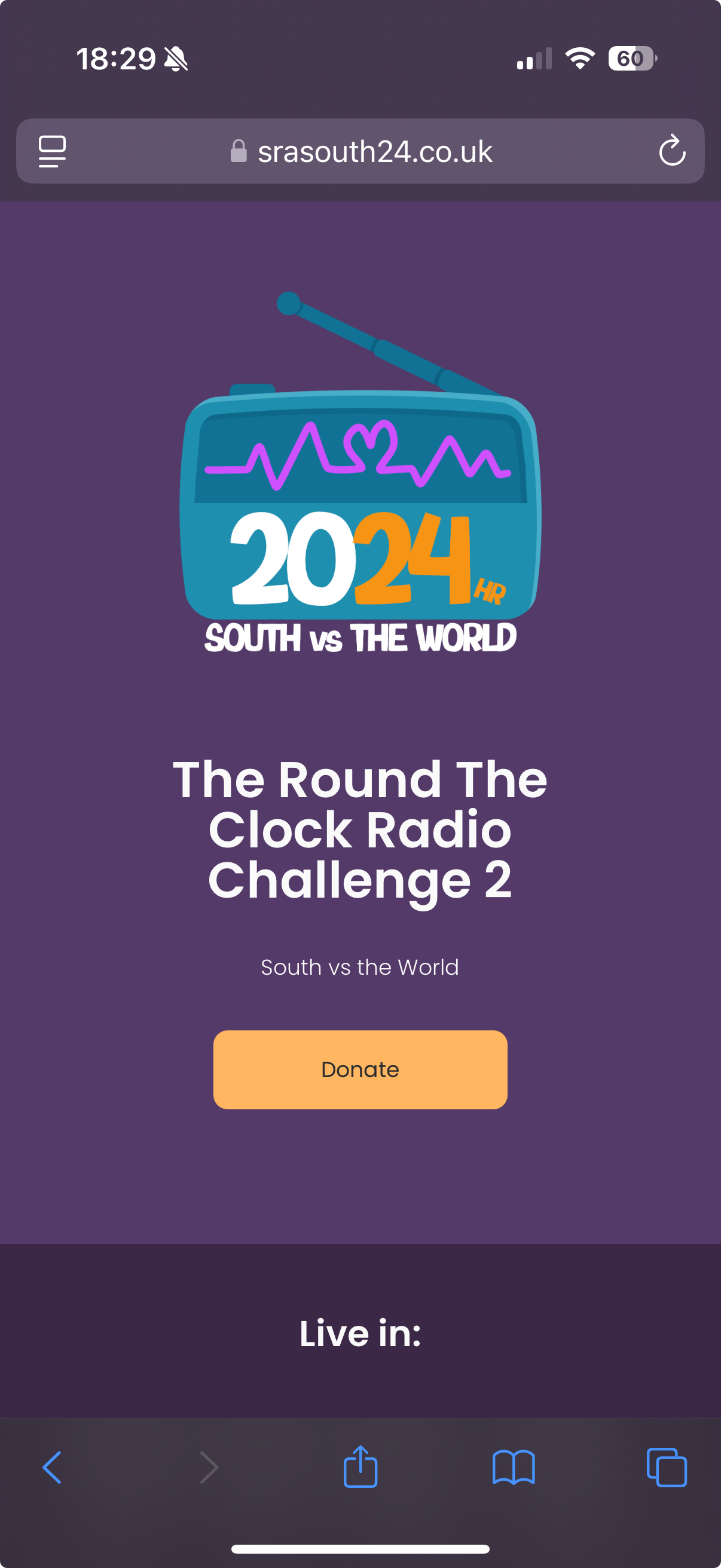
To design the website, I started by researching simplistic and sleek web designs to gain inspiration for my own. Using Figma, I could create a dummy version of the website to test out different design styles before coding them. For simplicity, I decided that all of the information should be featured on one page, so that users would not need to go through menus to find any important information. As a result, I divided each section of information into blocks to separate them and make navigation of the page easier. Two key features of the website were a link to donate to the charities, and a live timer that would count down to the start of the broadcast. Once I had completed each stage of the project, I could send my progress to my brother to post on social media. The cohesion created between the social media and the website influenced the brand identity and helped to promote the event leading up to the broadcast.
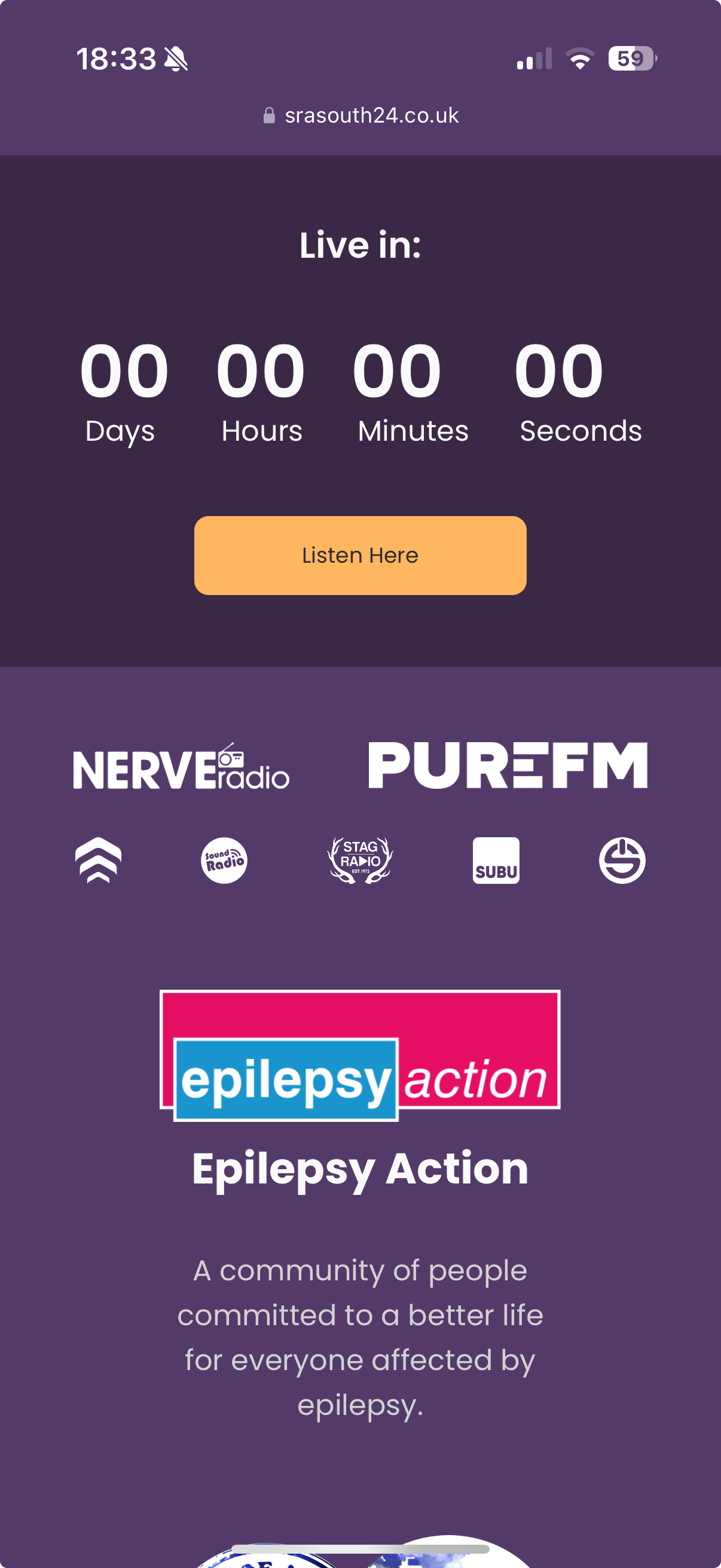
For the website, it was important to ensure all the text on the page was easy to read. This meant that I opted for light pastel background colours that would not conflict with the white text. I also used a large text size, and a sans serif font to improve readability. To ensure the text was readable at any screen-size, I used scalable font-sizing in the code, which meant the text would automatically resize itself when the window was adjusted. Responsive web design was paramount for this project, to ensure the website could be accessed from any device, and that its sleek design was consistent. To achieve this, I added break points for different window sizes. To adjust the content of the page. A good example of this is the stack of logos for each radio station, that can be viewed in multiple amounts of rows depending on the size of the screen you are using to view the website. I also used constraints, so that elements on the page will be aligned correctly when the window is resized. It was important to make every logo on the page clickable, so that users could also view each individual radio stations website or view each charity.
Every time I am tasked with creating a website, I need to learn new ways of solving problems that arise in the code, or how to create an entirely new element. The main part of the website I needed to add was a countdown to when the broadcast would go live. This would require java script, which I have limited knowledge of. As a result, I decided to find a tutorial on YouTube to teach me how to create it from scratch. Being able to develop websites through HTML, CSS and Java Script is a very valuable skill, and my proficiency in coding with these languages steadily improves with every project. For this website, I had the prior advantage of how to create responsive design from the beginning, which reduces the number of issues I may have run into later into the coding process. This project was also very beneficial in reinforcing my soft skills. My workflow for this project improved the efficiency of the project, and by visualising my designs through sketches and mock-ups I could ensure the project always had a sense of direction.
The communication in this project was paramount to its success. Early into the project, a communication channel was set up so that my brother and I could contact the client easily. As I was utilising the agile project methodology, constant communication was necessary in order to influence they style of each design. Regularly updating the client on my progress meant I always had a sense of direction, and did not waste time designing or developing anything that would not be used. The project would not be complete until the client was completely satisfied, so gaining their feedback was vital. As well as this, I also needed to regularly communicate with my peer, as he was in charge of the social media account for the entire event. This included sending him progress on my work to feature as a post, and agreeing colour schemes and font choices to ensure there was cohesion between each of our designs. Since my peer could not launch the social media until I had created the logos, constant communication was especially important at the beginning of the project so that he could prepare for when I had finished designing the logos.
Since this project had two deadlines (the social media launch and the website launch), it was important to carefully consider how long each step of the process would take, and to plan for contingencies such as extra logos or major changes to designs. Since there was a relatively short planning and research phase, I could begin designing iterations of the logos immediately which allowed for plenty of time for feedback. Overall, my time management in this project was very good, and ensured that the project consistently developed. The website deadline was met with time to spare, which was beneficial as there was time to ensure the website launch went smoothly and could be advertised on the social media. During the brief, there was mention of also designing merchandise for the event. If there were more time, I would have liked to design them, but as the deadline was drawing close, the event producer used a third-party business to order shirts with the logos I had designed printed on them.
The best part of this project was the communication and time management, which heavily contributed toward the quality of the designs and meeting the deadline. As a result, the design process went smoothly, being able to quickly change designs based on feedback from the client, and working together with my peer to create a cohesive brand. If I were to conduct the project again, I would create a brand guidelines reference sheet to ensure that all fonts, sizes and colour schemes were uniform, to further contribute towards a synergized brand identity.
Due to the wide breadth of designs that needed to be created for this project, many applications were used. For the logo, I used Adobe Illustrator to refine some assets for use (I.E. image tracing to improve the quality of an image). When creating the actual designs, I used Adobe Photoshop, as this is the software I am most proficient with. For the website, I initially used Figma, to create mock designs of how the website would look. This provided me a template to work from when coding the website from scratch, so that I could plan for the layout and structure my code accordingly. For the coding process, I used Visual Studio Code, which provides countless features to assist in web development. One in particular is the live extension plug-in, which allows you to view what the webpage looks like in real-time.
Creating the branding for the round the clock radio challenge was a valuable experience that provided unique design challenges. The ‘south vs the world’ aspect allowed for a creative solution in designing the logos, and ultimately influenced the style of the event. Being able to design the entire branding with my peer allowed for brand cohesion and gave us room to be creative. I was also able to further hone my coding abilities, as well as my soft skills such as time management and communication. This project will directly influence how I undertake large scale branding projects in the future, as well as event management.
Appendix 1 - Waterfall project methodology research
https://business.adobe.com/blog/basics/waterfall
Appendix 2 - Fantasy novel research
https://www.goodreads.com/genres/fantasy
Appendix 3 - Mockup hardback book template
https://www.graphicsfuel.com/hardcover-book-mockup-2/
Appendix 4 - Round the clock radio challenge website
https://www.srasouth24.co.uk
Appendix 5 - Agile project methodology research
https://blog.devgenius.io/how-to-work-with-agile-development-innovation-cd8aeab0abdaRtcrc website
Appendix 6 - Javascript countdown timer tutorial
https://youtu.be/_LExTzOhe7s?si=ercCywsWG05-pGl5