For this project, we were presented with a variety of clients that all had unique tasks. The project that piqued my interest was based around a game called ‘Tomebound’. In this tile-based puzzle game, you play as two wizards that have been cursed by a book at the top of a tall tower. One wizard can only move forwards and backwards, and the other left to right. The aim of the game is to complete puzzles through each floor of the tower, until you eventually reach the bottom and escape. Both wizards have a unique special ability. One wizard is able to summon portals to travel to other tiles, and the other can use drones to lift tiles and move them around. As a designer, my involvement was to design UI elements, icons, and logos. One other designer was working on this project, so we decided to divide the workload between us, playing to each of our strengths. I prefer to design icons, so I chose to start with designing the character special ability icons.
My communication with the client was very consistent and frequent, which allowed for me to effectively employ the RAD (rapid application development) project methodology. This entails a relatively short planning phase and focuses more on developing iterations of the designs to present to the client for feedback. This is preferable, as the goals of the design are much clearer, and the client can specifically convey what they are looking for. As well as this, I could communicate easily with my partner which meant there was good cohesion between our designs. The RAD project methodology was designed by James Martin in the 1980s. Despite being created over 40 years ago, due to its simplistic nature, the methodology is still effective today.
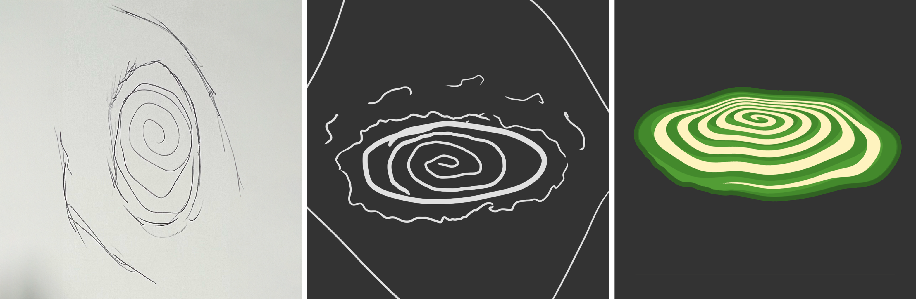
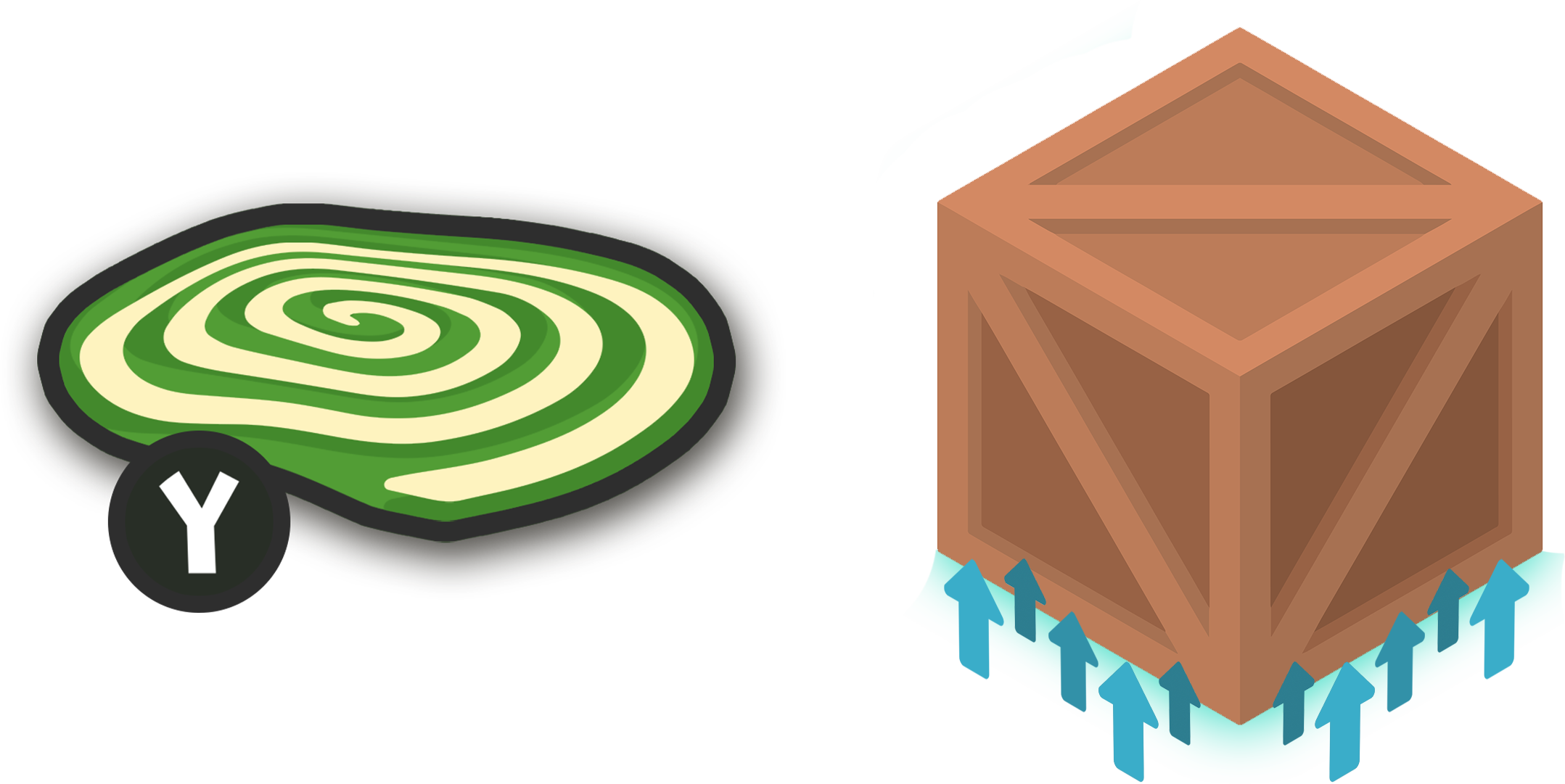
My first step was to sit down with the client, and discuss what they would like done, and any specific features they needed for the designs. I started with the portal special ability icon, which required a bold 2D design. As the character had a green colour palette, the icon also needed to use green. After rough sketches on paper, I decided to also create some sketches digitally with a graphics tablet, which enabled me to visualise how the icon would look on-screen. This method is very efficient and time-conserving, as I don’t have to fully realise an idea I have and can quickly see if my idea would be worth designing properly. When designing the icon, I made sure that all important layers in the project were preserved to ensure that they could be used or changed at a later date if needed. This meant that if the client or one of my peers needed something edited in order for the design to work more cohesively with other elements of the game, it could be done so without major amounts of work or damage to the design. A good example of this was that the icon needed a visual representation of what button you needed to press to activate it, however this would need to change depending on the platform you were playing on. To make sure this could be edited easily, I created a separate layer for the button and used a font to ensure that the different symbols needed for each platform worked as a set.
Upon completing my first draft, I submitted it to my client for feedback. I had weekly meetings with my client, which provided structure to my workflow. On the next meeting that we had, we discussed what was good about the icon, and what needed to change. Namely, that the swirl I had incorporated into the design had too many lines in it. During these meetings, we could also discuss other parts of the project he was looking to have completed. Me and my peer could then decide which designs we were going to do, depending on our strengths. After meetings with my client, I could work on both icons simultaneously. The bulk of the portal icon had been completed, which meant I could prioritise the next icon.
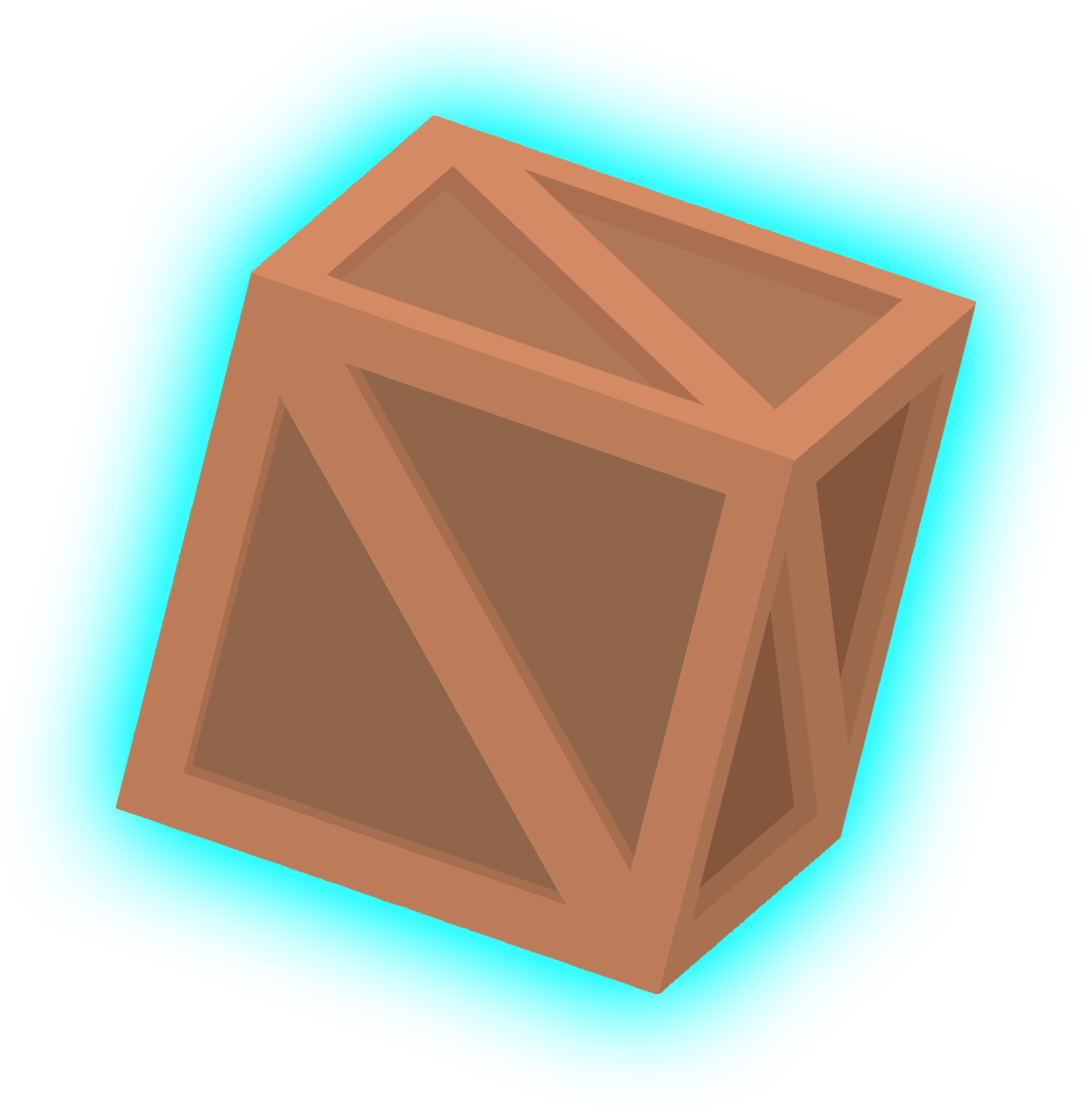
For the next icon, I had to design an icon that represented the ability to lift or levitate objects. Initially I designed the icon to resemble more closely what the ability would look like in game, whereby drones would be used by the character to lift tiles off of the ground. However, after feedback from the client, it became apparent that this would not work as the icon. To fix this, we decided to utilise a crate being shown lifted, as this is a more common way to depict levitation in games. I decided to utilise additional programs for the icon, using Blender, a 3D modelling program. This way I could create the crate I needed for the icon, and then position the camera isometrically to get it exactly the way I wanted. Additionally, I added ID textures to each face of the crate, so that the colours of the crate can be changed easily in the future.
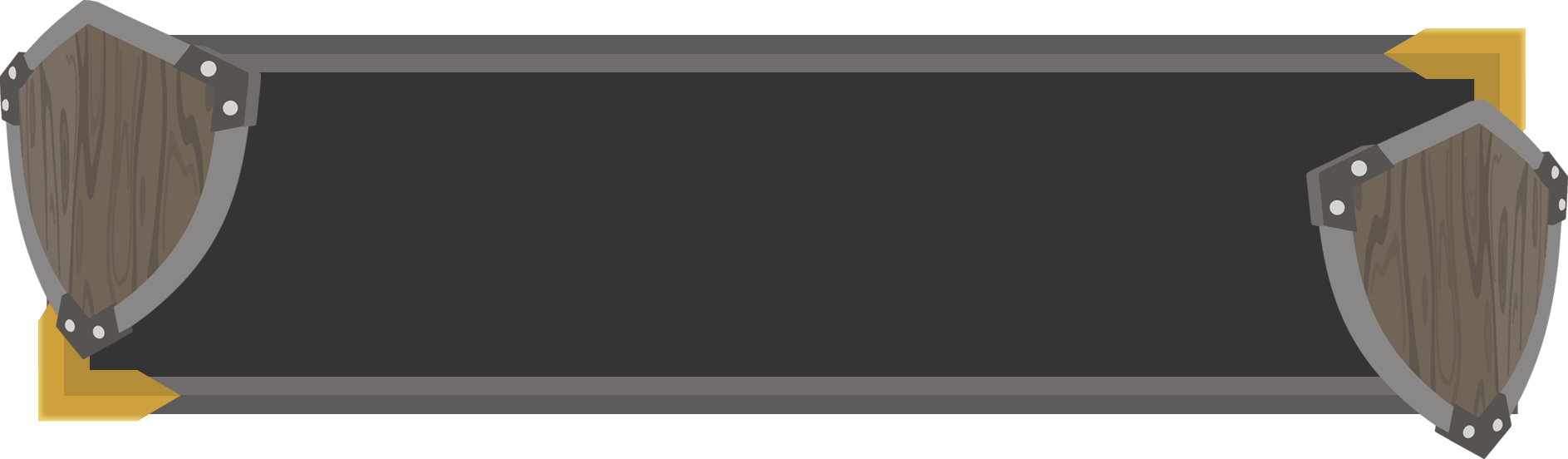
By this point in the project, we needed to present our work so far. After working closely with my peer, we created a PowerPoint presentation that fluently displayed everything we had worked on, while explaining the basis of the game to provide some context for what requirements our designs needed to fulfil. Presenting our work so far allowed for a different perspective, and more feedback so that we could further improve our designs. As well as the icons, I was also asked to create a UI element box for when characters needed to teleport between floors of the level. This required a stylised border for the box, and pixel art versions of both wizard characters, and the main book (tome) from the game. After discussing with my peer, we decided that they would create the pixel art, as this is something they excel at. I would work on the border/background. Utilising the teams’ strengths when creating designs will likely increase the quality of the overall project.
To begin the design, I sketched out what I wanted the background to look like. I decided upon a shield on each side for the border, as well as a sword like asset for the top and bottom. As I knew that someone on the 3D team had modelled a shield for the game already, I asked them if I could use that as a base to work from. This meant that I could then recolour this and convert it to 2D, without having to make the shield from scratch. I could then add simple shapes for the background of the UI element. I needed to use dim colours, so that any text that appeared would be visually striking. Our final presentations for the project provided the last opportunity to gain feedback on each of our designs. My main feedback for the teleport UI background was to make it less symmetrical and make the shields on each corner face slightly more toward the camera. I also added gold plating to two of the corners, as this broke up the colours of the design. The other feedback I received was for the drone icon. Originally, the icon was positioned isometrically, but the client requested it was skewed on its side, to convey the impression that it was in low gravity. I was able to re-render the crate I had modelled with a new camera position, but due to time constraints I could not find a way to add the arrows that were previously included in the design in a way that was aesthetically pleasing.
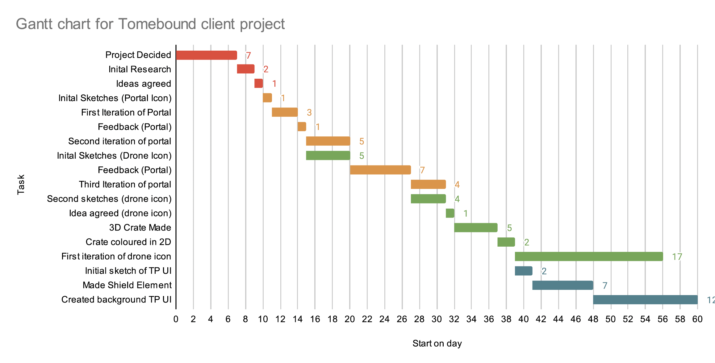
For this project, I attempted to stay on top of my time management to ensure that I met all deadlines. This was especially important as some designs I worked on were dependencies for other parts of the project, and thus missing deadlines would have resulted in delaying my peers in completing their designs or features of the game. Communication was particularly effective for this project due to the consistent meetings with the client, which allowed for up-to-date information and constant feedback so as to not spend too long designing something incorrectly. I also communicated well with the other members of my group, however the frequency of communication toward the end of the project did lower, meaning some designs were more difficult to complete. In the Gantt chart, it shows that the research phase of this project was relatively short compared to designing and prototyping, due to using the RAD project methodology. In this project, I significantly improved my workflow from my first year. Using sketches and iterative design allowed me to work much more comfortably, as well as completing them more efficiently.
During this project, one aspect that went well was the communication between me and the client. This assisted in providing me with direction for how my designs should look, and what I needed to change to fit the aesthetic of the game. This allowed for more cohesion between every team member’s work. Additionally, this project enabled me to explore different software, to fit the requirements of design. Utilising blender for 3D aspects of designs was far more efficient than attempting to imitate 3D in photoshop or another photo-manipulation software. Learning to use different pieces of software will help me in the long term, as I will be able to find effective methods for solving diverse problems that may arise in future projects. An area I could have improved on during this project was communicating with other pathways that were also working on the project. 3D designers may have created models fitting a particular colour scheme or style, that would not have fitted with the UI designs that me and my peer were working on. This may have resulted in a divide between art choices later on in the project, but fortunately this was avoided due to the client’s specific detail on style that was provided through the initial brief and future feedback. If I were to continue the project, my primary focus would be on completing the drone icon, as gathering more feedback from the client will provide clarity on how the arrows from previous versions of the design can be integrated into the latest. To ensure that my designs can be easily implemented into the game, the photoshop files need to be made easily accessible so that designs can be changed via the individual layers. Additionally, I would like to impose the icons and elements I have created over screenshots of the game. providing mock-ups for what icons or UI elements will look like in-game will help for more constructive feedback in the future. A logical continuation of the project would also be to create more UI elements for the project, such as the main menu, the players inventory, or even a cosmetics shop.