
This project involved creating a design, or series of designs, relating to our RSA project. The RSA project was another module, where I had to write a case study on one of the chosen briefs. The brief I chose was apply AI, where I had to explore how AI could assist in the climate crisis we are currently facing. This project aligned with this case study, where we were tasked with creating designs that worked alongside the study. I chose to create a series of social media posts explaining how AI worked, and what it could be used for. These infographics played a part in my case study, as I used them as evidence for how the general public could be naturally informed about AI and its many possibilities. To initiate the project, I created a mind map using Freeform, a vector-based note taking application developed by Apple. This included basic research and initial ideas I had about the project. The mind map I created was beneficial for putting all of my possible ideas and routes I could take the project in one place, so that I could easily refer back to it at a later date.
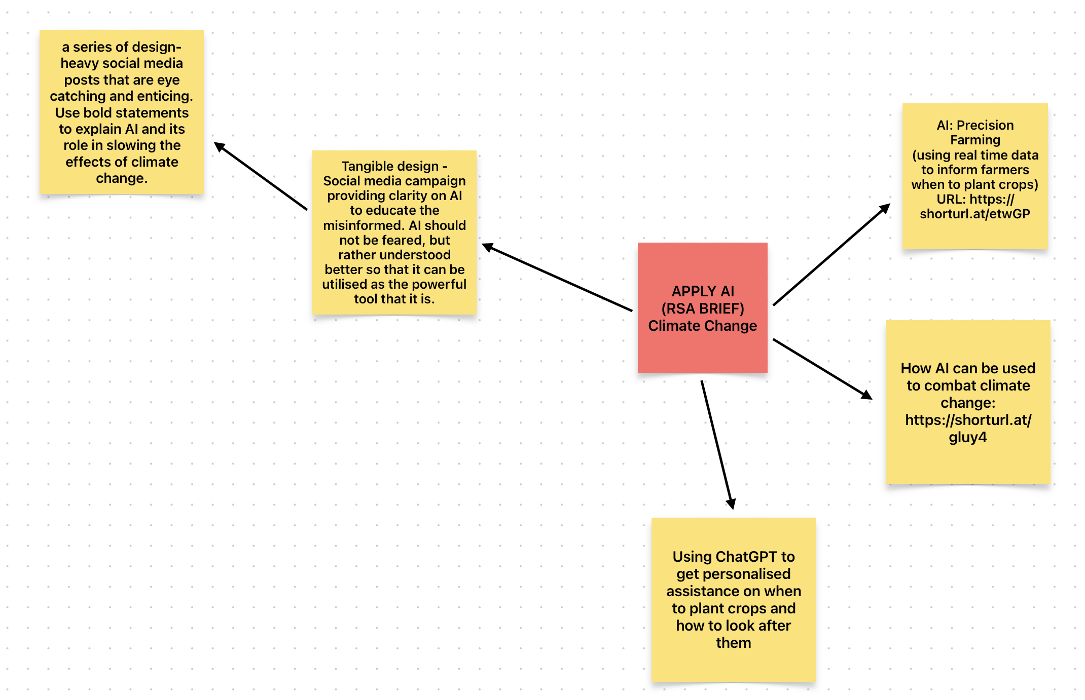
Originally, I had planned to create designs for a prototype device, that would utilise AI to analyse patterns in areas such as weather and soil to assist farmers in increasing their crop yields. Ultimately, after considering the scope of the project, I had decided that I could not design this to a satisfactory standard in the time I had to submit this project. If I were to continue this project, that area would likely be what I would focus on. For this project, I decided to employ the waterfall methodology, which was developed by Winston W. Royce in 1970. The waterfall methodology relies on all planning being done at the start of the project, and then moving through the stages step by step (development, implementation, maintenance). This methodology was perfectly suited for this project, as there was no client to communicate with once the project had commenced. This meant all planning could be conducted at the beginning of the project and allow me to move through the project in increments. The benefits of this are that everything can be planned out accurately, as the project can be fully comprehended early on, and no further requirements are likely to be added into the project at a later point. Although, due to the very nature of the methodology, the process is not flexible once underway, so being confident in the planning stage is vital.
During the planning phase, I had decided that I wanted to create a set of social media infographics that would logically connect to one another to teach people the basics of AI. Due to this, I decided that the posts should be visually themed so that they could be identified as a set of posts. This has the major benefit of being able to create a story throughout the posts, and possibly increasing user engagement, as readers can easily identify the other posts through the theme. The subject matter of the post included AI, and how it could be used to help the environment. As I had logically linked the posts together in order, the theme could follow the colour scheme these attributes relate to. AI typically uses a blue colour pattern, due in part to its ties of technology, intelligence, and data. The environment is heavily linked to the green colour palette, following in the footsteps of nature itself (leaves, grass, etc). I then created a gradient of 8 steps (the number of posts I was creating) between a pastel blue and green, so that on social media the colour would seamlessly transition throughout the posts.
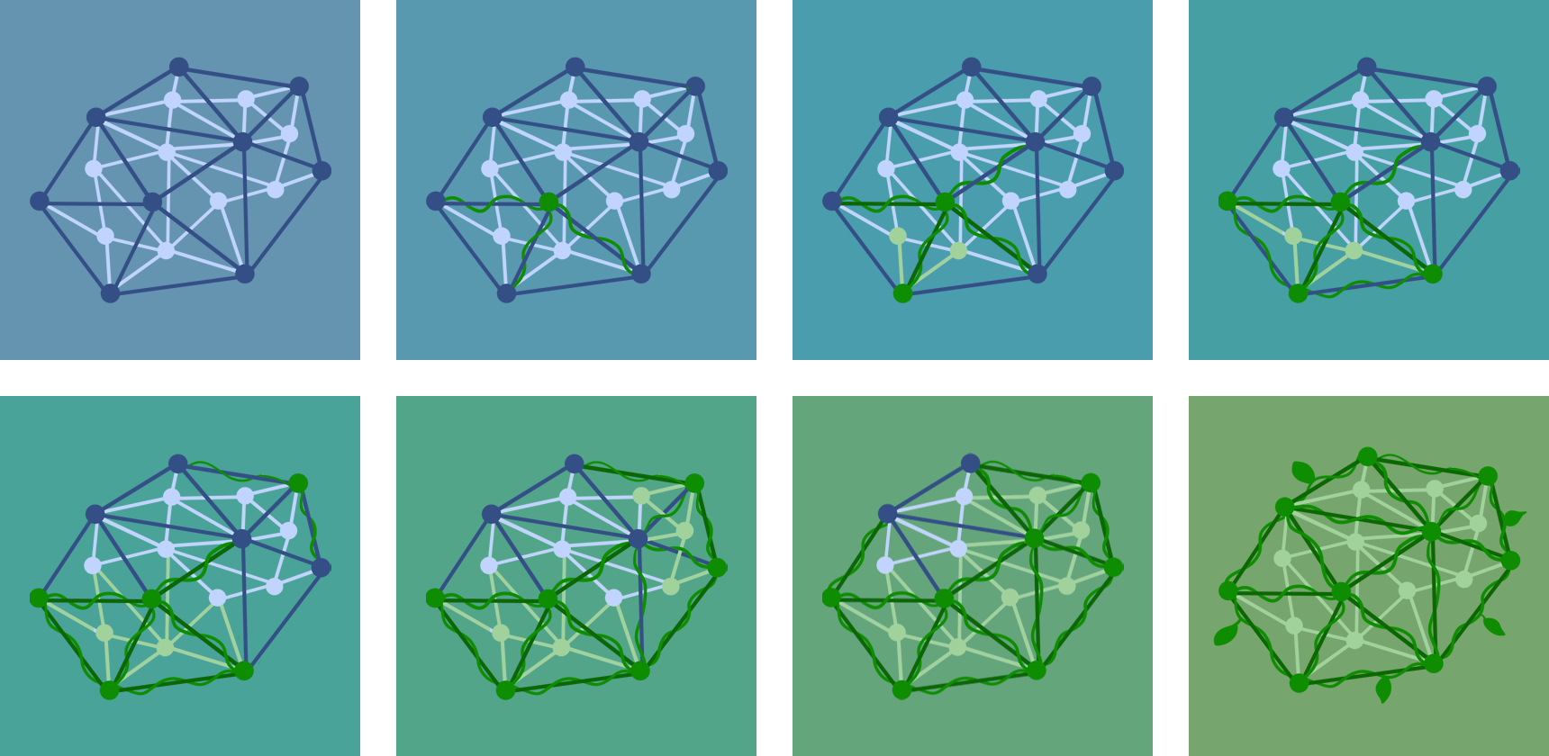
For the content on the posts, I decided to add a unifying asset to each post to further link them together. A common motif of AI design is 2d meshes, consisting of an irregular pattern of circles, connected by lines. To represent the shift of subject from AI to the environment, I created a mesh that would be used in each post and edited it into 8 different stages of nature. This would assist in providing context for the reader about what the post was about. An example of this is a mesh that featured a prominent colour palette, would be more environmentally oriented. I had planned for 8 specific subjects for each of the posts to explore, which would logically link together to provide a cohesive learning experience. I primarily used photoshop to create the social media posts, as I am most familiar with this application and am able to use it efficiently and effectively. Its shape tools allowed for me to make the various icons I needed for each post. On top of this, using guides in photoshop helped me to position everything in the post accurately. Additionally, I also used applications such as freeform to visualise what the posts would like together in a grid. This provided the advantage of being able to look for any obvious errors or decide if they colours worked well together in grid form before uploading them to Instagram.
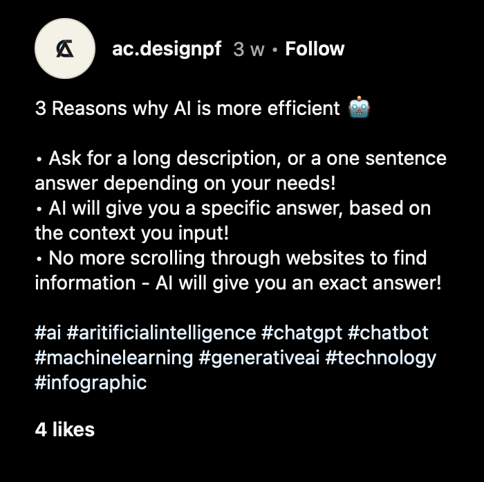
After creating the social media posts, I slowly began to upload them to social media. Initially, my plan was to upload them at peak times in the day to maximise user engagement. I also scheduled to upload two posts per week for four weeks, but due to time constraints I was unable to stick to the schedule. Despite this, I steadily uploaded all eight posts over six weeks. With every post, I needed to write a description that would expand on the key information of each infographic. However, it was important to not write too much for each description as this would negate the point of the infographic, and its key feature of being able to be read very quickly. Along with the description, I also added several relevant tags to each post, in an attempt to attract people looking for posts related to the subject of AI. These tags help to categorize the infographics and will help Instagram to promote them to the correct target audience. For that reason, it is essential that appropriate tags are added to each post.
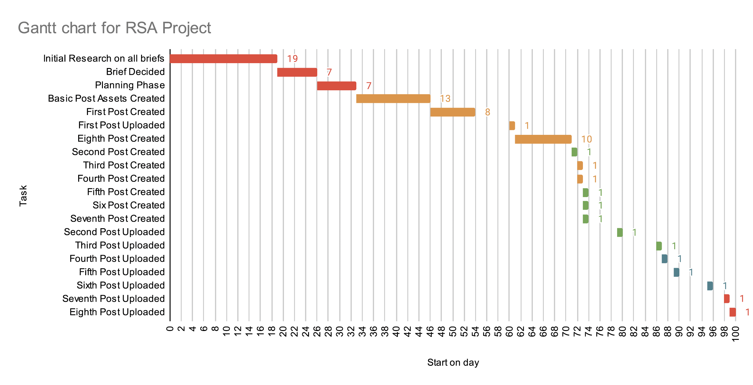
This project was being worked on at the same time as another, and as a result, managing my time for this project was difficult. The other project involved a client that required constant communication to refine my designs, which meant prioritising that project so as to not fall behind or hold my peers back from completing their work. I initially completed the planning phase for this project early on to ensure I knew what work needed to be created but did not complete many designs straight away for this project as I was focusing on other work. This meant I could not adhere to the upload schedule I had created for myself. This is reflected in the Gannt chart, where the first social media post was created far earlier than the rest, and all other posts were uploaded to social media around a month later. In a real-world scenario, I would need to ensure that these posts did follow an upload schedule, to ensure that each posts’ user engagement is maximised. I would also have created an account for the posts and completed further branding such as a logo and a biography. I found managing my time in this project particularly challenging and ended up created most of the social media posts over a space of three days. While I am satisfied by the quality of each social media post, if my time had been managed better, I would have more time to gather feedback from peers and refine each post to ensure it is the best it could be.
One area of the project that went particularly well was the cohesion between all of the social media posts. This is due in part to creating assets that would feature throughout all of the infographics, which provided a firm link between each one. Utilising colours that changed through an eight-step gradient also helped unify the posts together. I also took the time to learn how to use Photoshop’s shape tools to create icons, which is a highly applicable skill. These icons help add flair to each post and make them far easy to interpret than a wall of text. Another major benefit was utilising the waterfall project methodology, as it provided a structure that made my workflow far more streamlined. Completing all of my planning at the beginning of the project allowed me to accurately provide a timescale for how long each phase of the project would take, and thus alleviated the possibility of running out of time.
If I were to complete this project again, I would make sure that I balanced my time more evenly between all the projects I was working on so that no project’s quality would suffer. An effective way to do this is to create a schedule to work by, that incorporates all projects, to make it easier to evaluate how much work needs to be completed on each project. Additionally, I would also have a longer planning phase, and to consider contingencies to avoid any delays on the project being completed. This way, if I were to fall behind for any reason, I would still have allotted time to complete the work and submit it on time without any stress or loss of quality. I would also have benefitted from using tools such as Figma or preview, which provide insight on how my designs would look on social media before I uploaded them. While I did utilise these tools for my project, I did not during the planning phase which meant there was less time to edit my designs if they did not fit aesthetically. A good example of this is that I created eight posts, but Instagram’s grid layout features three posts per row in the grid view of an account’s feed. If I created nine posts, the infographics may have fitted on the grid feed better. If I were to continue this project, my priority would be converting the infographics to fit for other formats. This could be TikTok image slides or twitter posts, or could even be hard copies such as posters, that could be used in places such as classrooms.
While I had created social media posts of this nature before, I consider this project to be the first time that I have carefully planned out each post and worked toward creating a group of posts that all link together. Overall, I consider this project to have been a success, as well as complimenting the RSA case study that explores ways in which AI can assist in resolving the climate crisis.