ACDESIGN


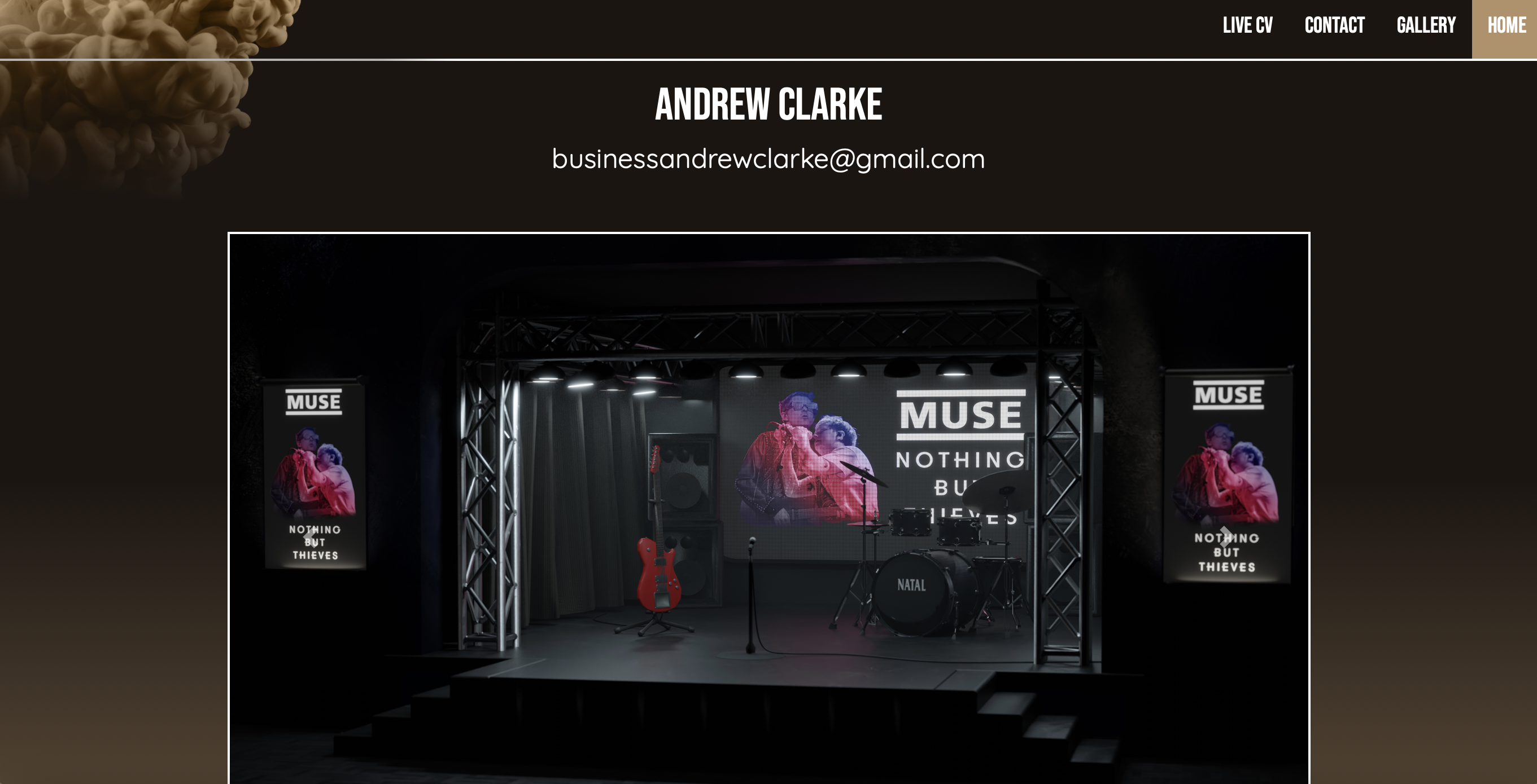
The biggest project for me in the 1st year of university was the website itself. The first course of action was to sketch out how I wanted the layout of the website to look. Right from the get-go I had decided I wanted a hexagonal tiling system for the portfolio part of the website. A carousel to show off my best work, and a sleek, modern design. I learnt a lot of how to code using the website w3schools.com, which offers tutorials on the fundamentals of coding in HTML and CSS. Once I’d roughly sketched out the layout, I began laying out the base html. This involved code for the nav bar, the about me section, and links to the other pages. At the start, the other pages only contained placeholder images and lorem ipsum text, to pad out the website.
Next, I moved onto the base designing in CSS. The background was created using a gradient from black to blue. The nav bar took a very long time to design and format. First of all, I coded the hover animation for the options in the nav bar. The background for the nav bar was created using paint in water, that was taken from unsplash.com. I faced a large problem with the nav bar as I wanted the background to fade into the overall gradient. This took a couple weeks to solve, but in the end, I fixed it by using to gradient masks going in different directions, that would then blend the gradients into one another.
After that problem was fixed, I added bootstrapping into my code so that I could add a carousel onto the homepage. After that, all I needed to do was write out the about me section and the homepage was finished and functional. The next part of the website I worked on was the live CV. I created a base a4 template that could apply to my CV, and each individual page for my portfolio which meant I wouldn’t have to code the same thing over and over again. This was done by creating a div and filling it with a solid colour and giving it the dimensions of an a4 page. I then added a glow to the page to make the design more interesting. After that, I filled out the page with my pre-existing CV, and added a picture of myself for context that would also be featured on the about me section on the homepage.

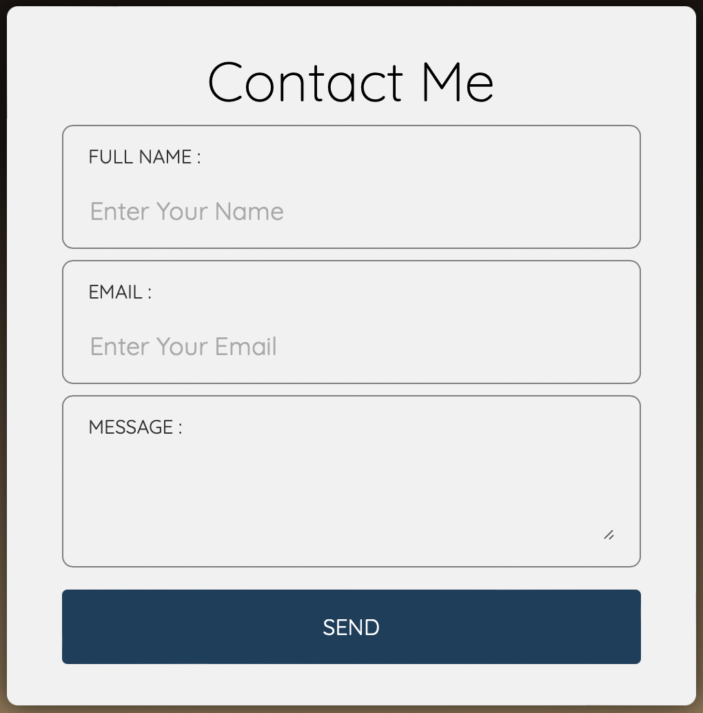
For the contact page, I made a small form with different input types. This means that someone who visits the website can put in their email and send me a message. For this to work, I utilised formsubmit.co, who forward the email to me. I then styled the form with the same colours of the website to keep it on theme. At this point I also decided to add buttons at the bottom of each page that would link back to the other pages, so that the user doesn’t need to scroll back to the top to go to other pages. These buttons feature a hover effect, which changed the spacing between the letters, and adds a glow around the button you're hovering over, which helps indicate where you are aiming on the screen. I had issues with positioning these buttons to display responsively, which meant I had to not display these buttons when the website was viewed on a mobile device.

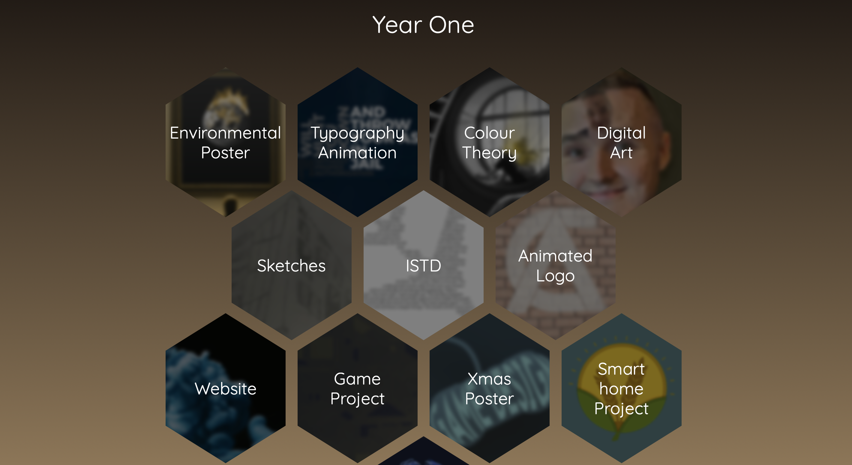
For the gallery section, I added links to each page of my work. I then needed to style these so that they were formatted as hexagons in an even pattern. To do this I followed a tutorial on W3Schools.com that showed me how to shape each image into a hexagon. I also added an animation on hover so that it would shrink, to outline which option was to be selected.
