ACDESIGN


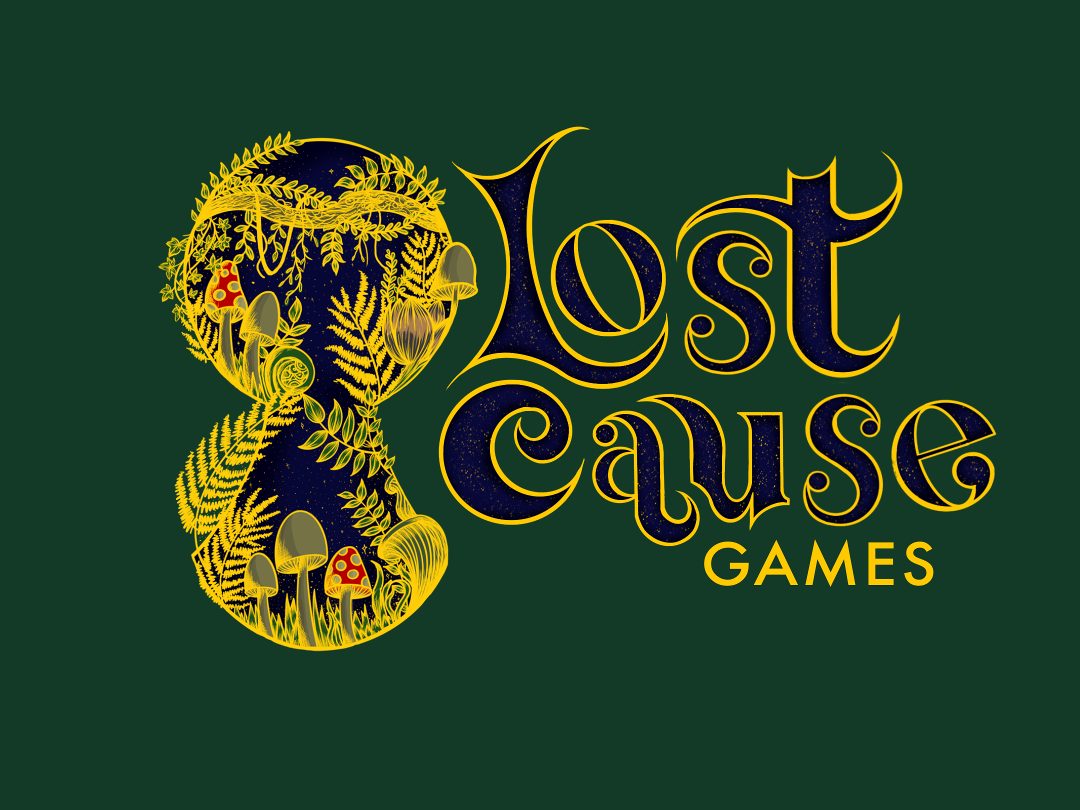
For this collaborative client project, I had the opportunity to choose from a range of client briefs. Most of these were provided by the university, but we also had the option to provide other client briefs if we preferred. While I was initially attracted toward another brief (BarBox), One of my peers had asked if their game’s studio branding could be put forward as a client brief. This piqued my interest, as there were far more tasks that could be shared across designers working on the project. I decided to create the website for the game studio, which will be called Lost Cause Games, whereas my peer chose to create the logo, and the landing page animation. As there were only two of us working on the project, the deliverables could be split up easily, and there was sufficient work to be done for everybody.
The brief for Lost Cause Games was to establish a brand for the company, and to initiate an online presence. The main deliverable for the project that I chose to work on was the website, which I’d need to produce from initial sketches to the final outcome. A clear theme for the studio’s branding had already been substantiated, which was to use dark, botanical colours, and nature-related elements. The target audience for the studio (and subsequently the website) were game publishers and distributors, as well as customers looking for new games to play. The project timeline consisted of 12 weeks, but the project could be continued afterwards if necessary. Thanks to an extensive document outlining the brief, there were no aspects of the project that were left up to ambiguity, which provided me with a clear direction to begin designing the website right away.
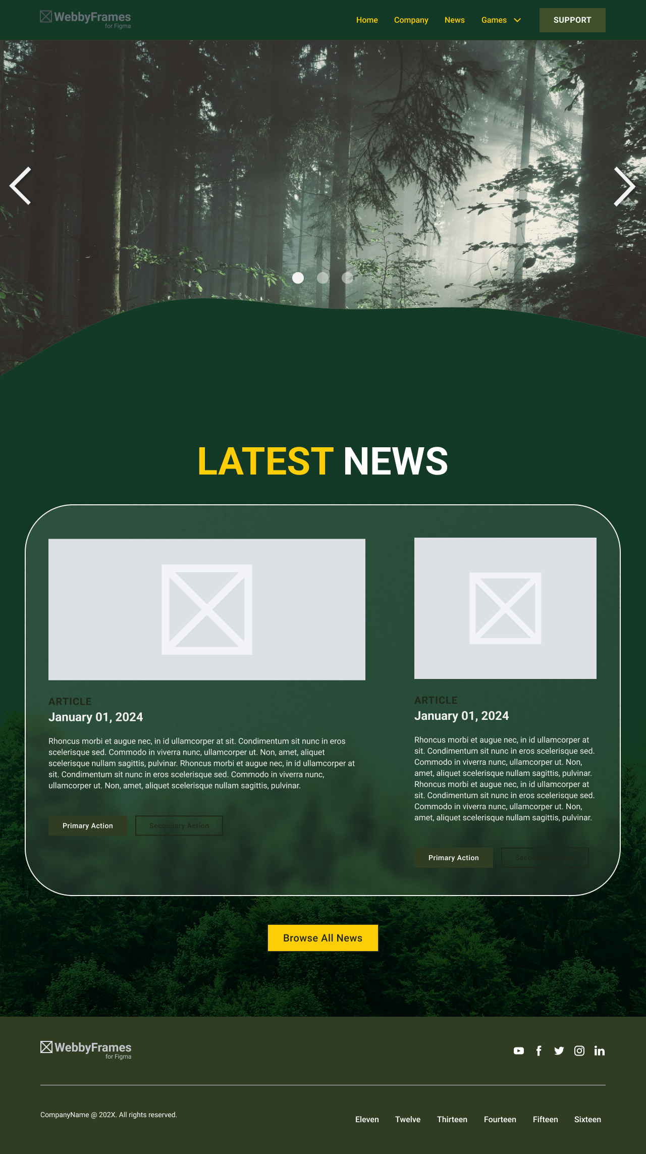
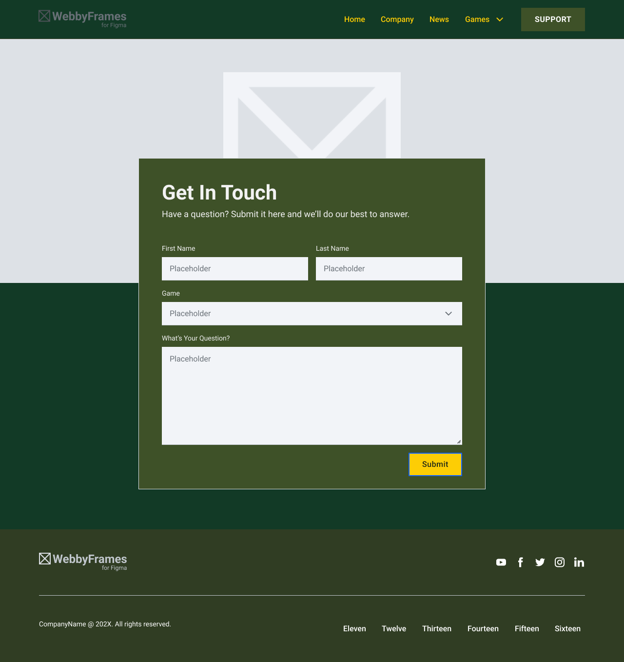
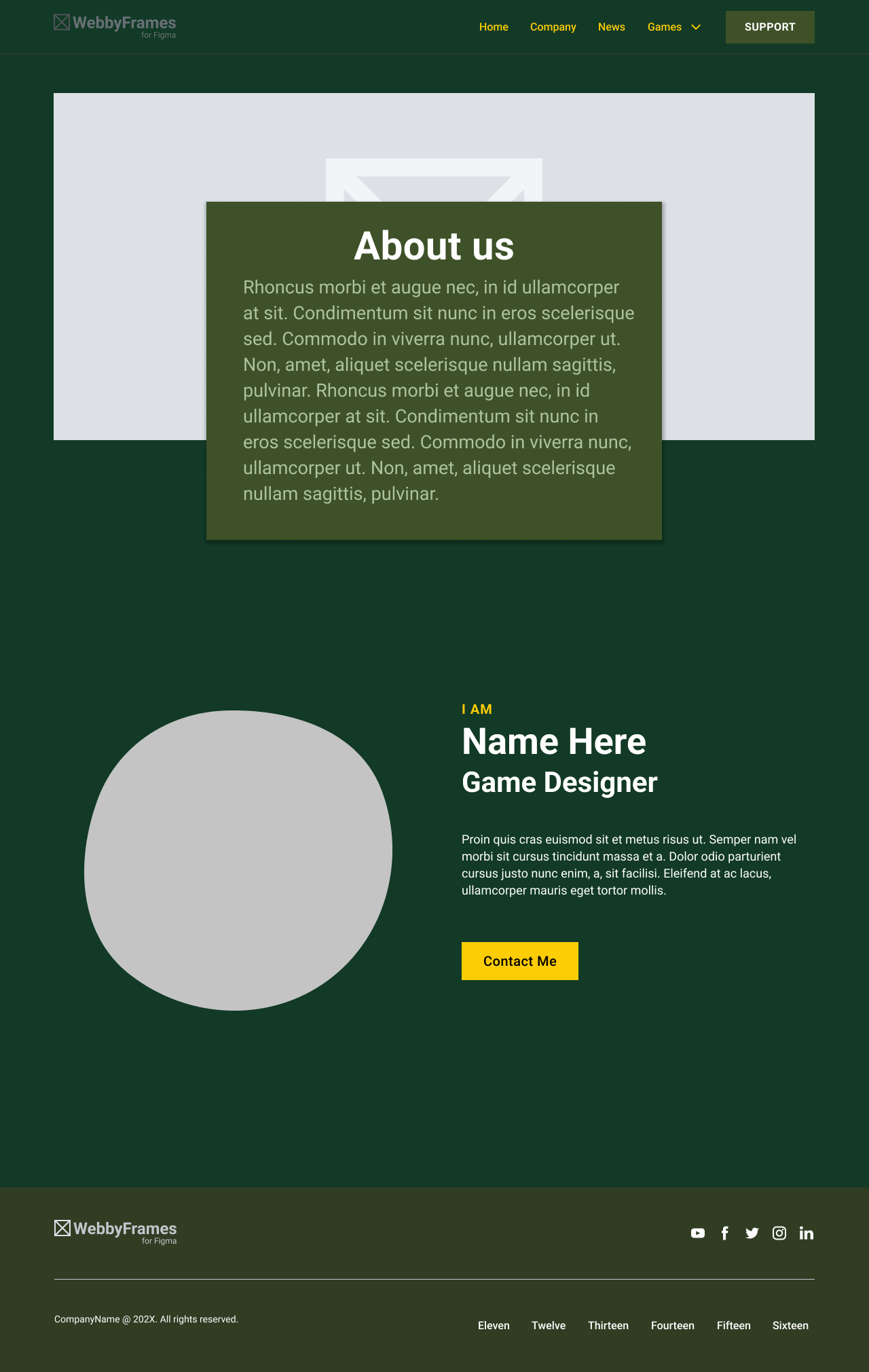
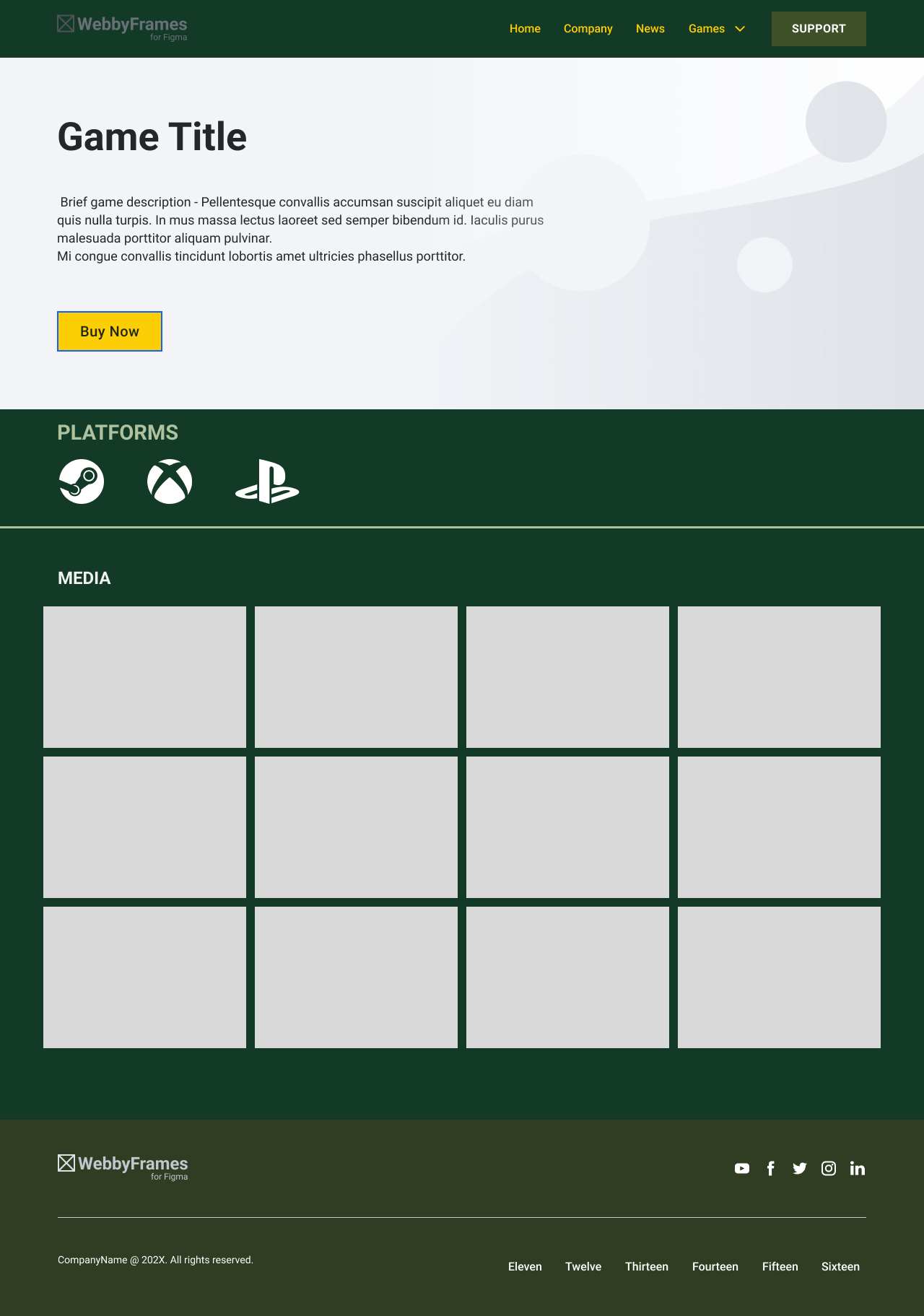
The aim for the website was to create a fully functional website that aligned with the branding of the logo and landing page animation. The website needed to showcase the studio’s portfolio of games, as well as a news section, who the team were, what services the team provided and any contact information. It was important for the website to be developed with the target audience in mind, as the launch of the website will heavily contribute to the online presence of the studio and will also establish the studio’s themes and branding. Another important aim was to create templates for each page, so that they can be easily edited for new content that needs to be uploaded to the website. This would require me to ensure all the code I wrote was clean and modular, so that editing it at a later date was easy to do.
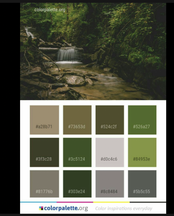
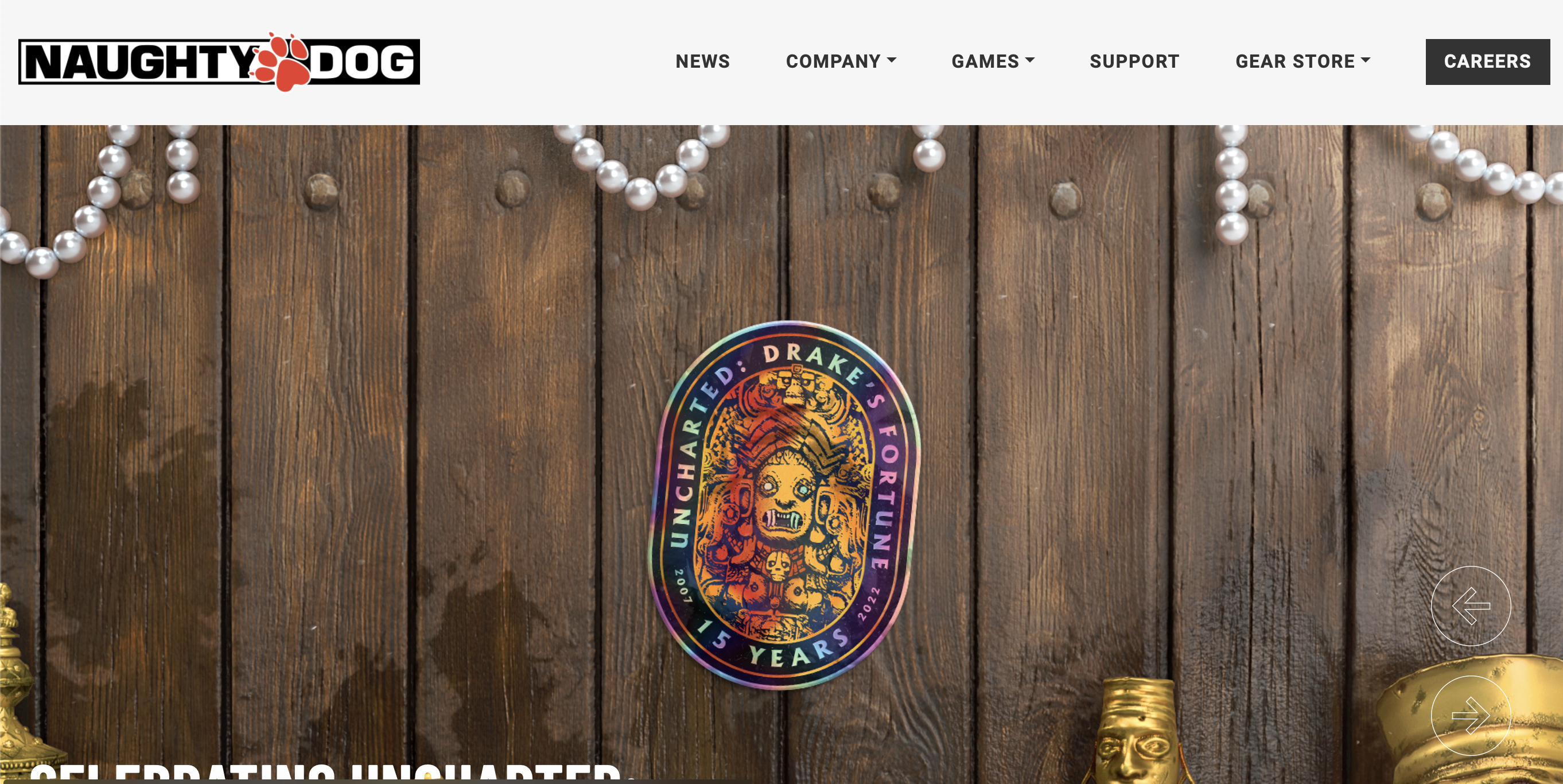
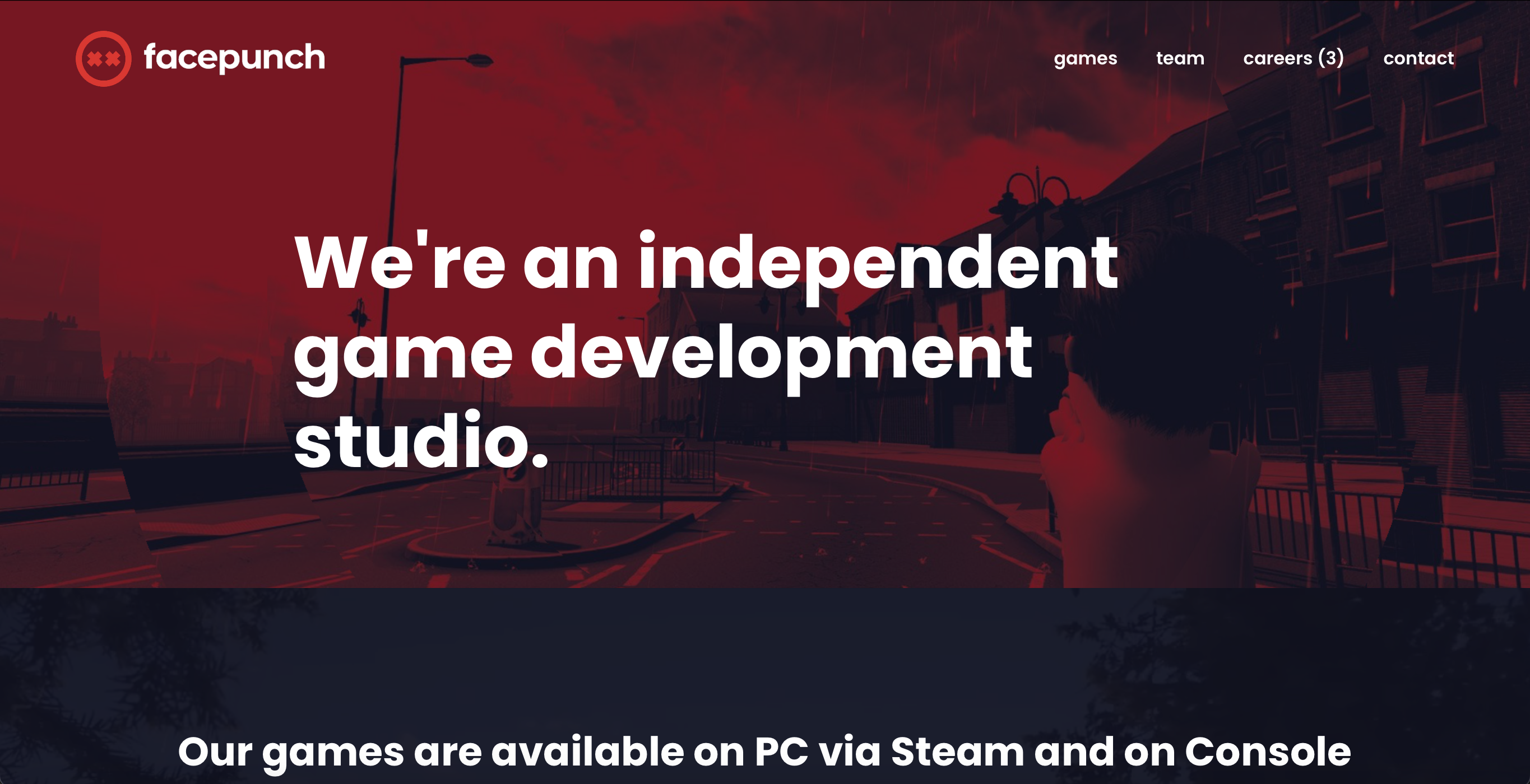
The research I conducted primarily consisted of looking into pre-established game studio websites, to find similarities in design choices and as inspiration for how I would design the Lost Cause Games website. One particular website I looked into was the Naughty Dog game studio website. This utilised minimal colours and kept a simplistic design which meant it was incredibly easy to read and navigate the website. These aspects of web design were something I wanted to incorporate into the project, as attempting to cram as much content as possible into each page would make my design feel too cluttered. As I was following the botanic theme that the client requested for the branding, I also researched into dark-green colour palettes, to find colours that worked well for readability, but still followed the aesthetic of the website.
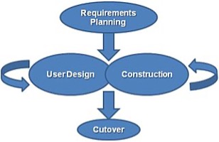
For this project, I chose to use the RAD methodology (rapid application development). This methodology was developed by James Martin in the 1980’s, and consists of a short planning phase, where the majority of the project is spent releasing iterations of the website to iron out bugs and design flaws. The benefit of this is that once everything has been designed adequately, the construction phase is relatively short. This applied well to the time frame I needed to work to, as I could gather feedback on the design of the website for the first 12 weeks, and then produce the functional version towards the end of the project. One disadvantage to this project methodology is that it heavily relies on solid communication, and the process can come to a halt if this isn’t achieved.
The majority of this project was spent using Figma. This software is specifically tailored for designing websites, which meant I could utilise its tools to make the design process far smoother. As the website needed to be fully functional, I could test how the website would work at different breakpoints, to ensure it was responsive and worked on any device. I could also use dev kits to implement ready-made assets for visualisation purposes, as opposed to designing them from scratch. Some specific parts of the homepage required unique assets, which meant I needed to use Adobe Photoshop to create them. In order to make the website functional, I used Visual Studio Code. I also used a plugin called ‘Live Server’ that was developed by Ritwick Dey, since this allowed me to view any updates I made to the website in real time.
A common pitfall when designing websites is not considering functionality on different types of devices. The majority of websites are now more commonly accessed by mobile phone, which has an entirely different aspect ratio to laptops or desktops. It is therefore vital to build the website in a way that ensures it can be viewed in any resolution. Thankfully, using Figma to initially design the website has the major benefit of constraints, which allow the window to be resized to any point, and the content within will adjust accordingly. This helps to plan out how to code the website at a later date, so that sections of content do not have to be duplicated to fit into different aspect ratios. Generally, it is beneficial to design the website to fit a phone first, as the content can then expand to fit any window size that is larger.
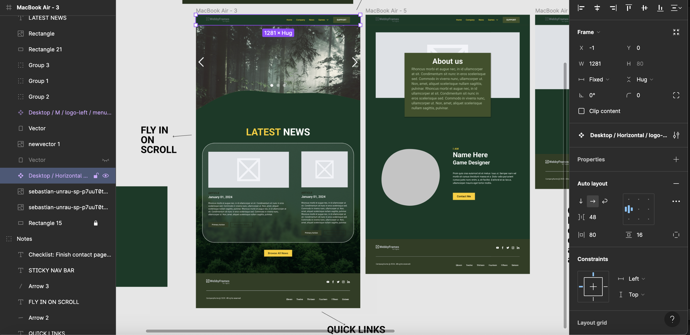
In this project, I was able to develop my skills in Figma. In the past I’ve used Figma to design my own website, which I found initially challenging, and this was my first time using the software. In this project, I had already learnt the basics, which meant I could test out using more advanced tools and plugins to improve my designs. I also learnt to use blending modes, so that I could apply blur to different layers, providing the design with some much-needed depth. The use of devkits also increased my efficiency, while keeping the website looking official and feasible. I also attempted to use an entirely new tool in this project, where you can convert Figma designs directly into HTML code through AI. While this would save lots of time, the process is still in its infancy and therefore does not work very well. However, valuable data such as hex codes and font styling can be instantly implemented into VS-Code, which did save me time.
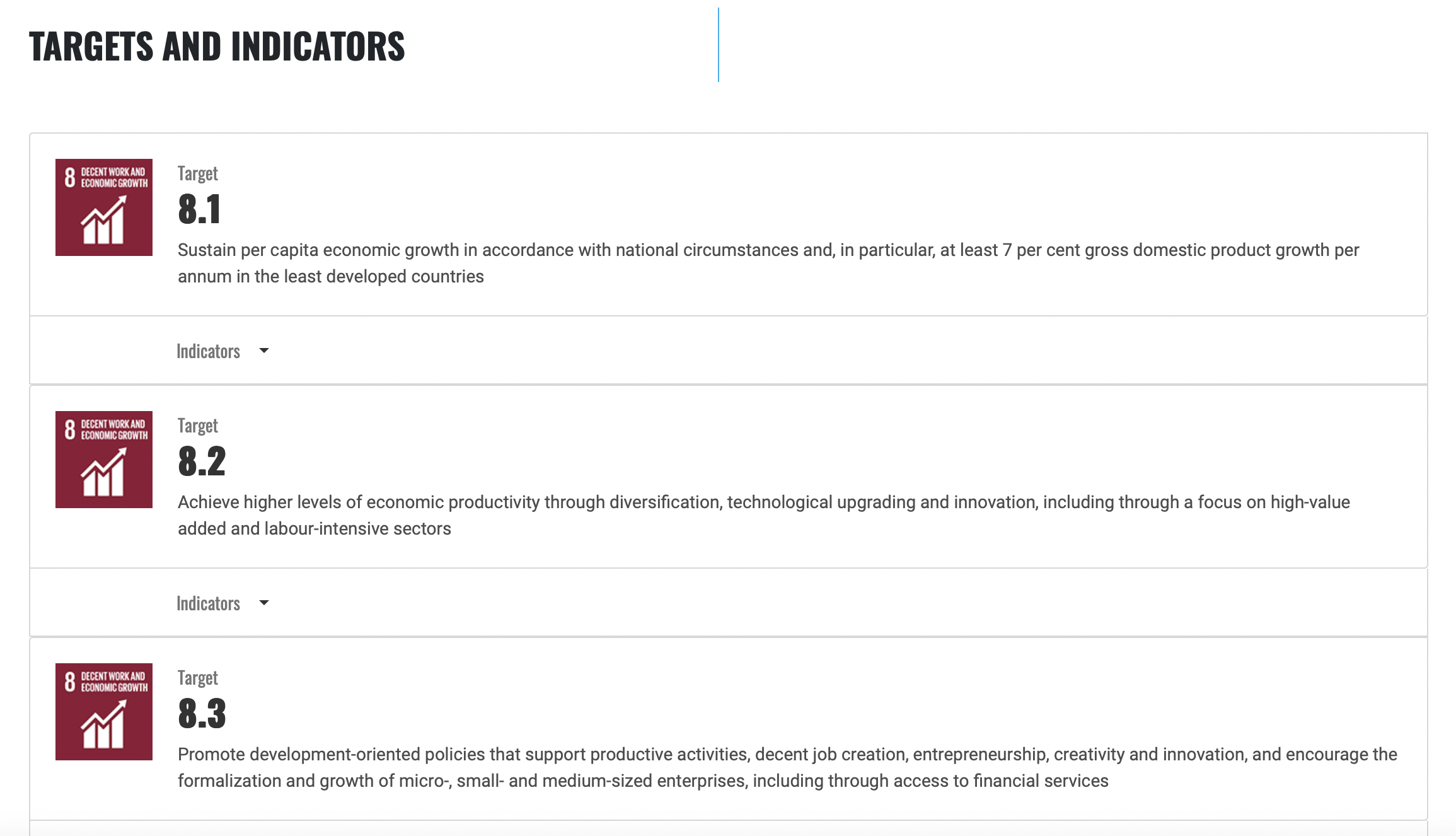
For this project, it was important to conduct my work in a way that would provide solutions to the issues related with SDG-8. More specifically, my work on the Lost Cause Studios website directly contributes to target 8.3, which is centred around promoting job creation, creativity, and innovation, and forming micro, small and medium sized enterprises. Establishing a platform and online presence for the studio allows for the prospect of game designers to display their talent and creativity. Additionally, the design of the website for the studio is intended to consume low amounts of energy to view when functional, in accordance with target 8.2. By utilising more innovative code and minimising file sizes for images and assets used on the website, the resources needed to navigate the website significantly reduce.
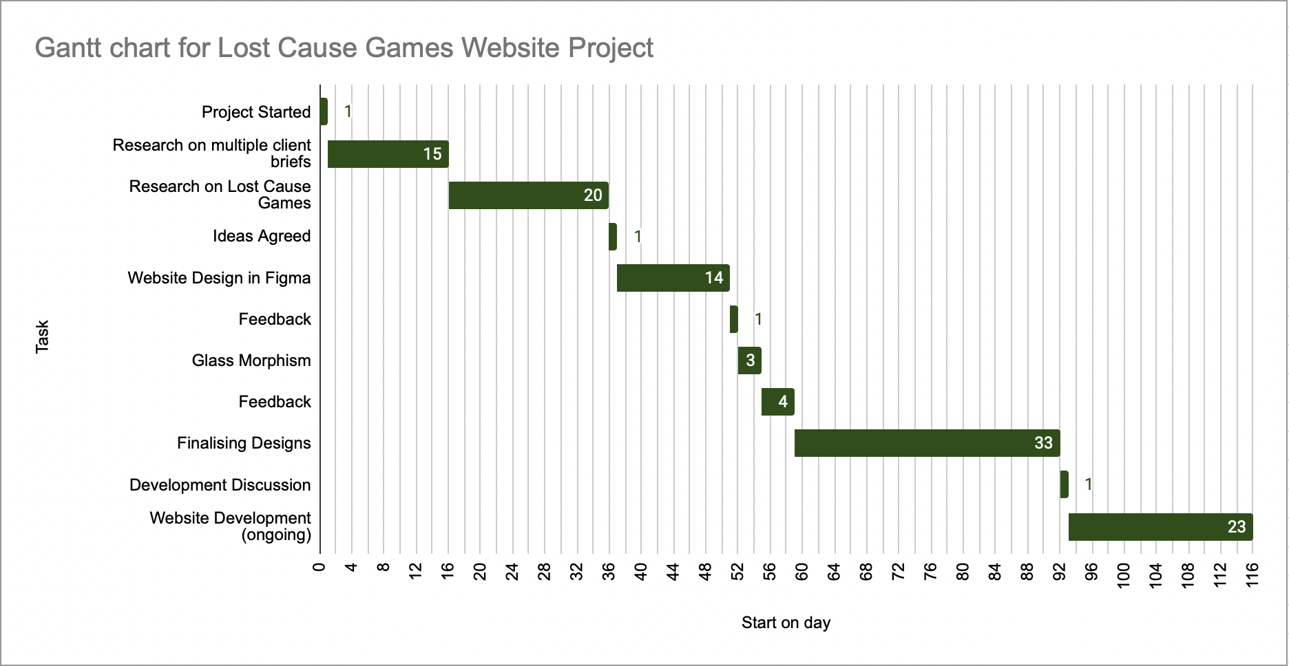
At the beginning of this project, communication in this project was irregular as we had not set up a specific means of talking to each other. This was soon rectified, as we made a Snapchat group chat between the client and the designers working on the project (me and one other). This meant that any questions we had in regard to designs could be answered efficiently, and without having to prepare a meeting. As well as Snapchat, I sent several emails to the client for more specific feedback on aspects of the website. Face to face meetings were also commonplace and easy to plan for. During breaks in term time at university, communication would slow down as everyone involved in the project was busy. Consequently, progress on the project also slowed down. Despite this, by the time communication had slowed down, I had sufficient insight to know what needed to be designed and changed about what I had already completed, which meant I could continue to work on the website at any possible time.
Managing my time on this project proved to be more difficult than usual, due to the uneven split of time I spent on each project. As creating for social media is something I particularly enjoy, I naturally ended up spending more time on that project before working on the website for Lost Cause Games. Ultimately, this meant I had less time to gain feedback from the client on what they liked and disliked about the design. This cascade of delays meant that moving into the development for the phase happened far later in the project than intended. Despite this, I still met the deadlines for both projects, albeit at different times. Typically, in previous semesters I spend an equal amount of time on both projects that are set throughout the whole timeframe. For this semester, I completed the projects sequentially (The social media project first, then the collaborative client project) which came with its own benefits and disadvantages. One major benefit was that solely focusing on one project at a time means that you can hone in on what needs to be done, which helped me with my productivity. On the other hand, if I had too many issues with the first project, I may not have left myself sufficient time to complete the second project adequately. Thankfully, there was enough time to complete both projects to a reasonable standard.
To summarise, I believe this project went well for the majority. Improving my ability to use Figma was one of the best parts of the project, as this is an application that I want to use in the future, and getting tangible practice is very beneficial. Another aspect of this project that went well was the clear sense of direction throughout the project, which helped me to meet the brief and complete the deliverables required alongside the other designer on the project. After the website has been released, the client will hopefully be able to use analytics to test which parts of the website are working the best and can also measure the load times to ensure each page is working properly. For this project, I intend to continue to work on the website after the deadline to ensure all bugs are fixed, and any missing features can be added. The aspect of this project that I struggled with the most was time management, which is something I am constantly striving to improve upon. It was also very beneficial to have easy communication with the client, as changes to the design of the website could be made efficiently. A good example of this was the background colour, which was fine-tuned based off feedback.
Appendix 1 - Naughty Dog Wesbite
https://www.naughtydog.com
Appendix 2 - Facepunch Website
https://facepunch.com
Appendix 3 - Colour Palette Research
https://icolorpalette.com/palette-by-themes/botanical-garden
Appendix 4 - Figma Wireframing Kit
https://www.figma.com/community/file/1221009141145444839/wireframes-kit-free-wireframing-websites-and-saas-ui-ux
Appendix 5 - VSCode Live Server Plugin
https://marketplace.visualstudio.com/items?itemName=ritwickdey.LiveServer
Appendix 6 - SDG8 Targets and Indicators
https://sdgs.un.org/goals/goal8#targets_and_indicators