This brief explores the way typography could be used to convey the content of the first and last chapter of a book. I have chosen the book ‘Lord of the Flies’ by William Golding, as I think the stark difference between the first and last chapters will be an interesting concept to explore.
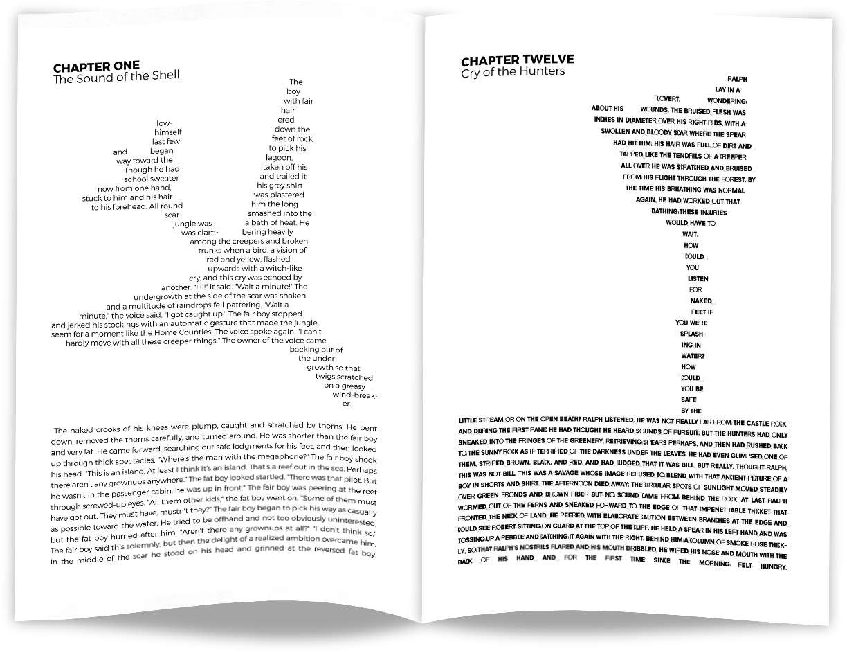
My initial ideas were to use the difference of order and chaos of the first and last chapter, to dictate how clean and organized the typography would be presented. For example, the first chapter would have a clean uniform font, with equal spaces and neat presentation, and the last chapter would be messier, using a rougher font.
Alexandria - This font would work for the beginning of the book, as it is clean and uniform, lending into the idea of the lack of chaos at the beginning of the book.
Object Orange - This font utilizes irregular weight and letter spacing which emphasizes chaos and supports the themes of the final chapter of the book.

My idea for examples of pages was to take objects of significance from the book, and use their shapes in the pages of the first and last chapter. To do this, I image traced these shapes in Adobe Illustrator, and then used the paths to dictate the layout of the text. For the first chapter, I chose the plane that crashes, as this is what causes the events of the book. For the last chapter, I used the shape of a pig-head on a stick, as this is a significant moment in the later stages of the book. I then used my chosen fonts that reflect the level of chaos at that stage of the book, and filled the shapes with text.