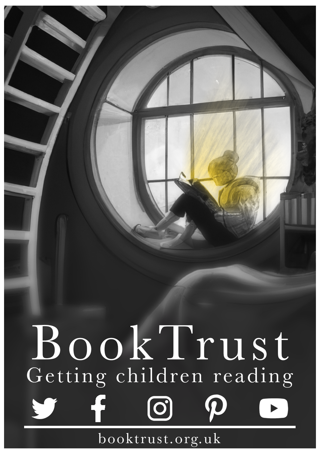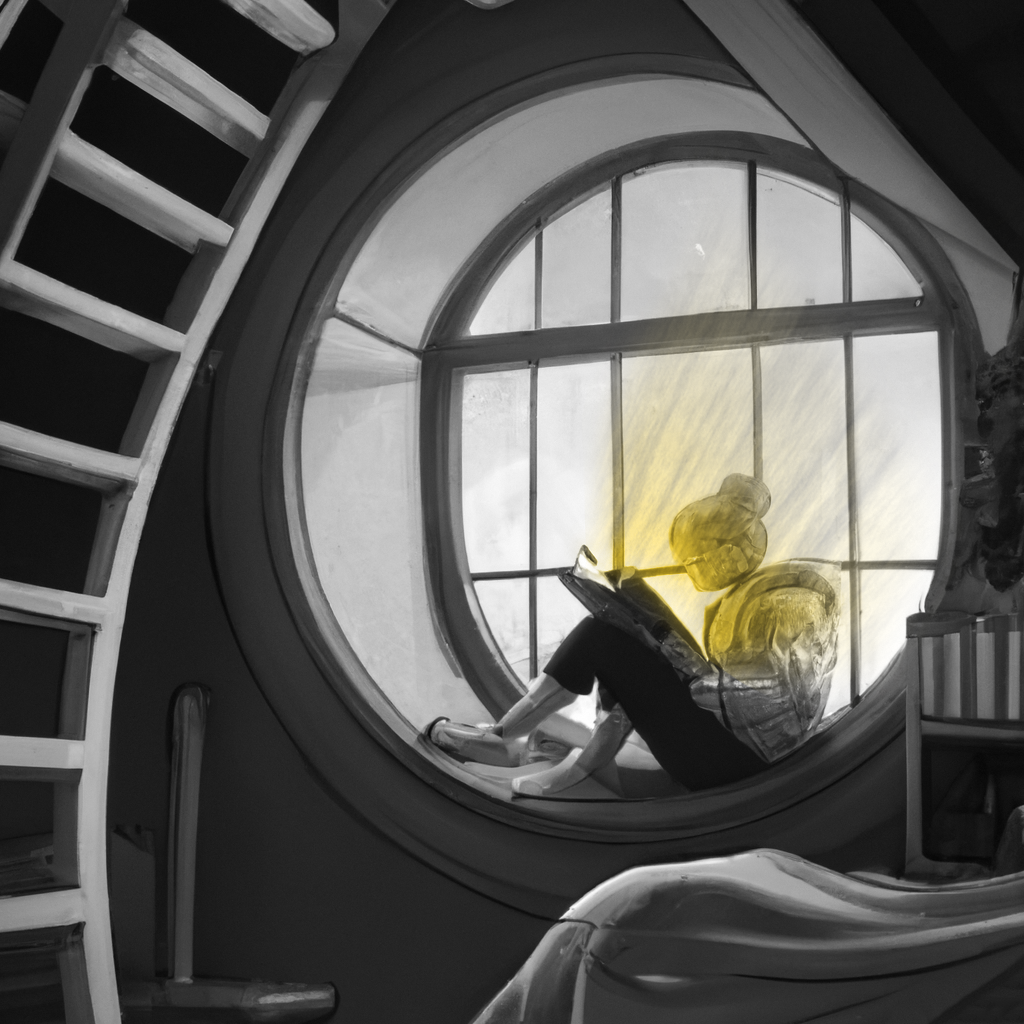
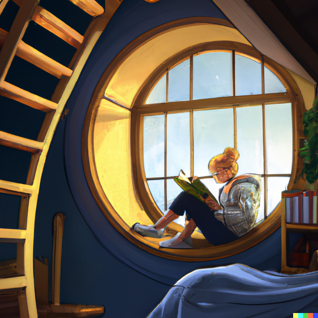
This task followed a similar pattern to the first weekly task, but with a lot more thought put into it. My first course of action was to decide what I thought resembled the colour yellow. I decided that yellow was a warm and happy colour, and something that brought me these emotions was reading in a cosy place. I therefore used an AI image generation tool to develop a base image to work off. This time I used DALL.E 2, which is much more powerful than the ai generation tool I was using before. From this image I made many adjustments in photoshop in order to get the desired effect I wanted for the task.
The first thing I did was make the entire image black and white, which allowed me to better emphasise any colour I used within the image. I then added a noisy yellow gradient over the whole image and applied a fully black mask in order to hide it. After that I could use B&W gradients in the mask, and the brush tool to portray the colour emanating from the book and shining on the subject’s face.
The next thing I needed to do as per the brief of the task was create it into a flyer. I decided to create an artificial flyer for booktrust.org.uk, as this was on theme for the idea I had. One problem I faced was that the original image I had created with AI was square, and thus the design for the flyer needed to be extended vertically in order to fit everything on the page. To fix this, I used content aware fill, and added a feathered blur so that the text in front of the design was easier to read. I then added icons for the social media that booktrust had and added a white border around the edge.