The range of charities and their various causes is a vast landscape, however, large well-established organizations dominate the market. Van Der Heijden (2012) Explored how the attention and support big charities receive is due in part to their expansive marketing resources, and long-standing reputations. While these charities are popular and well known for a good reason, they tend to overshadow smaller, community-based operations that have lesser budget and outreach capabilities. Guler et al. (2024) supports this notion and goes on to explain how smaller organisations are less likely to adopt emerging technologies such as generative AI, consequently further widening the gap between smaller and larger charities. Therefore, the growth and impact smaller charities can have is reduced, making it harder for donors who want to support a specific or more local cause to find a charity that fits their requirements. The heart of the issue lies with the lack of accessible information. Smaller charities are less able to commit resources to promotion and search-engine optimisation, missing out on crucial awareness that reduces the funding for each small charity and makes it far more difficult to grow in the future.
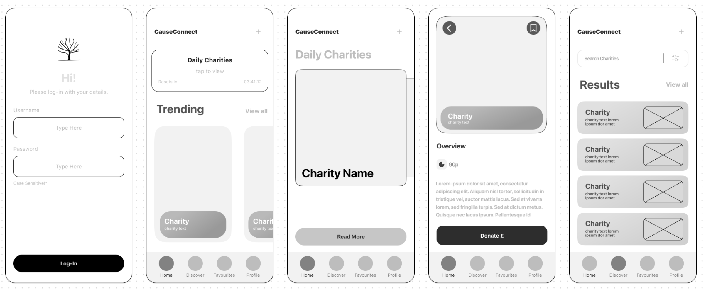
To solve this issue, my project was set around designing and developing an app that would act as a hub for all charities, where smaller organizations would be given the spotlight. This app would create an inclusive and easy-to-use platform for users to discover and learn about different charities, whereby donors can filter their results by location, type of cause, age and more. By promoting smaller and lesser-known charities through the app, they will be provided with a more equal footing online. Users will be given the chance to make more meaningful donations, specific to the causes they care about. A key feature of the app is the daily charities page, which displays three different organisations every day for users to learn about. The aim of this feature is to spread awareness, and keep user engagement consistent by providing a reason for users to come back to the app.
The core aim of this project is to develop a working prototype of the charity app that serves as a proof of concept to create a fully functional version. Within this app, I intend to create a series of pages that can be navigated through and interacted with. These pages include the homepage, a mock-up charity page, the login page and search page, which all help to convey how the app would work if fully developed. It is essential to develop the app in such a way that it remains easy to use and inclusive, providing users with an accessible platform to discover lesser-known charities. Beyond the physical product, this project also represents all that I have learnt throughout my time at university. Subsequently, I also aim to further improve my technical design abilities, particularly in Figma. This software continues to be updated and improved upon and serves as one of the core applications in my workflow. An area of Figma I have not used often is its prototyping and coding tools, which are perfectly suited for this project. Gaining experience and practice for these tools would be beneficial as it would assist me when developing other types of content, such as websites.
I also intend to showcase UX and UI design principles, that are at the core of these types of projects. Applying these principles to a real-world context will display how essential well-thought-out design can be for creating an easy-to-use product. Alongside this, I aim to create content that complements the main app, such as social media promotional posts and the app icon. These will be created in Adobe Photoshop and Illustrator, as I am most comfortable using these tools. An equally important objective is to enhance and showcase soft skills, that will directly impact the success and effectiveness of the project. Time management is paramount, due to the scope of the project and to ensure I can balance this project with other university commitments. I also intend to improve my project planning and research skills, to strengthen my workflow from the beginning. This project is well-suited for my final project at university as it combines elements such as social impact and technical skills and perfectly showcases my capabilities as a designer. It was important to me to produce the app in such a way that it can be developed further after my time at university, to provide me with opportunities after graduating.
The inequality in the market caused by large charities is predominantly caused by their vast marketing resources and well-established brands. NPC - New Philanthropy Capital (2023) recorded that small charities (that have an annual income of under £1 million) make up 96% of the sector, despite the fact that 80% of the total sector’s income belongs to the other 4%. This disparity inhibits smaller charities’ abilities to grow and advertise themselves effectively. This is a significant issue, since it makes it far more difficult for people to direct their donations to a particular issue that they wish to fix. Despite the large difference in income between small and larger charities, The Centre for Social Justice Foundation (2024) noted that 79% of adults would rather donate to smaller charities, as their money will be more impactful, and they can be more trusted. It is for these reasons that an app to promote and display a library of charities would be useful and contribute towards the exposure of under-appreciated organisations. It is also worth noting that larger charities are also fundamental in the success of the sector as a whole. As Link (2023) states, well-established organisations play a big role in society’s attention to volunteering and charitable giving in the first place. This stems from their brand recognition and the ability to use their reach and funding to scale their research and impact. Subsequently, the app I am creating will promote all charities equally, to remain inclusive and to utilise brand recognition to help the validity of the platform.
A prevalent issue that became apparent whilst researching ways to verify charities that could be featured on the app was that there are many fictitious charities that scam donors out of their money. RSM (2024) outlines how nefarious organisations disguise themselves as charities and then misuse donations and funding for different purposes. To prevent fake charities from being hosted on the app, I decided to utilise the government charity register, in order to verify each organisation. This register is a reliable way to ensure each charity is legitimate, as they go through an extensive process in order to be added. This includes an eligibility assessment (proof of public benefit), as well as data on the charity’s trustees, finance, and governing documents.
To develop the app, I decided to use Figma. This software contains an impressive set of tools configured to develop apps. Notably, the prototype tool allows for different pages of the app to be linked together and navigated through, allowing me to illustrate how the app would function in real time. Figma also features responsive design capabilities, which permits me to test the app on multiple different devices and resolutions. Figma is constantly being improved upon, which will help me to continue the development of the app after the conclusion of the project, as well as constantly innovating its performance. Recently, Figma announced a plethora of new features soon to be released, such as AI integration for prototyping and quality of life tools for developing apps and websites. While these tools were not available during the process of this project, they will be heavily influential on the production of the app once released.
As part of the brief for this project, it was important to ensure that the concept aligned with the UN sustainability development goal 10: to reduce inequality within and among countries. By promoting smaller and under-appreciated charities through the app, this project specifically works toward target 10.2. The aims of this target are to improve the social and economic inclusion of everyone, regardless of all diversities. By highlighting charities that work with under-represented communities, the engagement and assistance they gain will hopefully increase. Subsequently, this support will increase the inclusion of both the charities and the communities they are aiding. As well as this, the app works toward target 10.3, which aims to improve equal representation by eliminating discriminatory practices and reducing inequalities. Typically, larger charities dominate the online space, due in part to their vast number of resources and brand recognition. Through the app, all charities are on a level playing field, thus removing the imbalance of advertisement and providing all charities with an equal opportunity to grow and gain attention from potential donors. Finally, this project addresses target 10.8, which has the goal of expanding small and medium sized organisations. The purpose of the app is to highlight smaller charities to increase their promotion and growth, and by doing so connect them to a larger audience.
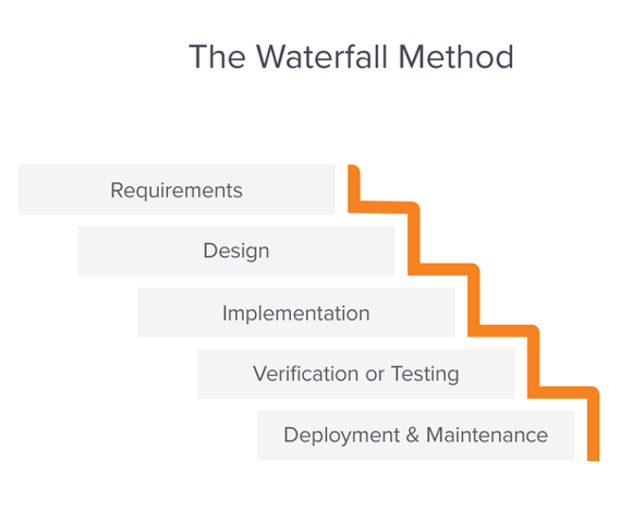
Utilising a well-thought-out project methodology can massively increase the productivity and effectiveness of a project. Fully planning out how the project will be worked on and incorporating contingencies before starting development prevents proceedings from coming to a halt when any issues arise. The waterfall methodology involves completing stages of a project sequentially, typically because aspects of the content can only be created once other steps have been completed. Alternatively, the agile project methodology requires different parts of the project to be completed at the same time, with a focus on collaboration and a short planning phase. I decided to use the waterfall method for the charity app because I wanted to extensively plan how the app would be created before beginning development. Utilising a strictly linear workflow provided an advantage as I could plan a specific timeline for when different parts of the project needed to be completed, which helped me to stay on track. On the other hand, this inflexible workflow meant if a part of the project took longer than expected, it would be difficult to make up time, which could lead to issues later on into the project. Because of this, I had allocated extra time into the development plan as a contingency. Additionally, there were different pieces of content I could work on simultaneously while problem-solving any potential issues with the development of the app, such as the logo or promotional social media posts.

In order to create the app, I started by creating a mind-map in Apple’s storyboarding software called Freeform. I have incorporated this app into my workflow for the last year, due to its vector-image support and the ability to instantly transfer each mind-map to my phone, thanks to Apple’s eco-system. My first step was to create post-it notes of all the essential information that needed to be decided before starting to create the app. Namely, the key problems that needed to be solved, designs that would need to be created, issues that I might run into and how the app linked to SDG-10. I also created an elevator pitch of what the app was. Laying out these crucial pieces of information in a clear manner was important, since it provided me with a clear document to refer back to that I could use to ensure what I was designing fit the brief. The next step was to note what pages would need to be created for the app, and any key features of the app I needed to specify. One idea was to create a ‘pennies per pound’ indicator for each charity displayed on the app, which would outline how much of your donation goes directly towards the cause. The aim of this idea was to ensure the app was transparent with its information on charities, in-line with SDG-10, by displaying inequalities that different charities working toward the same issue may possess.
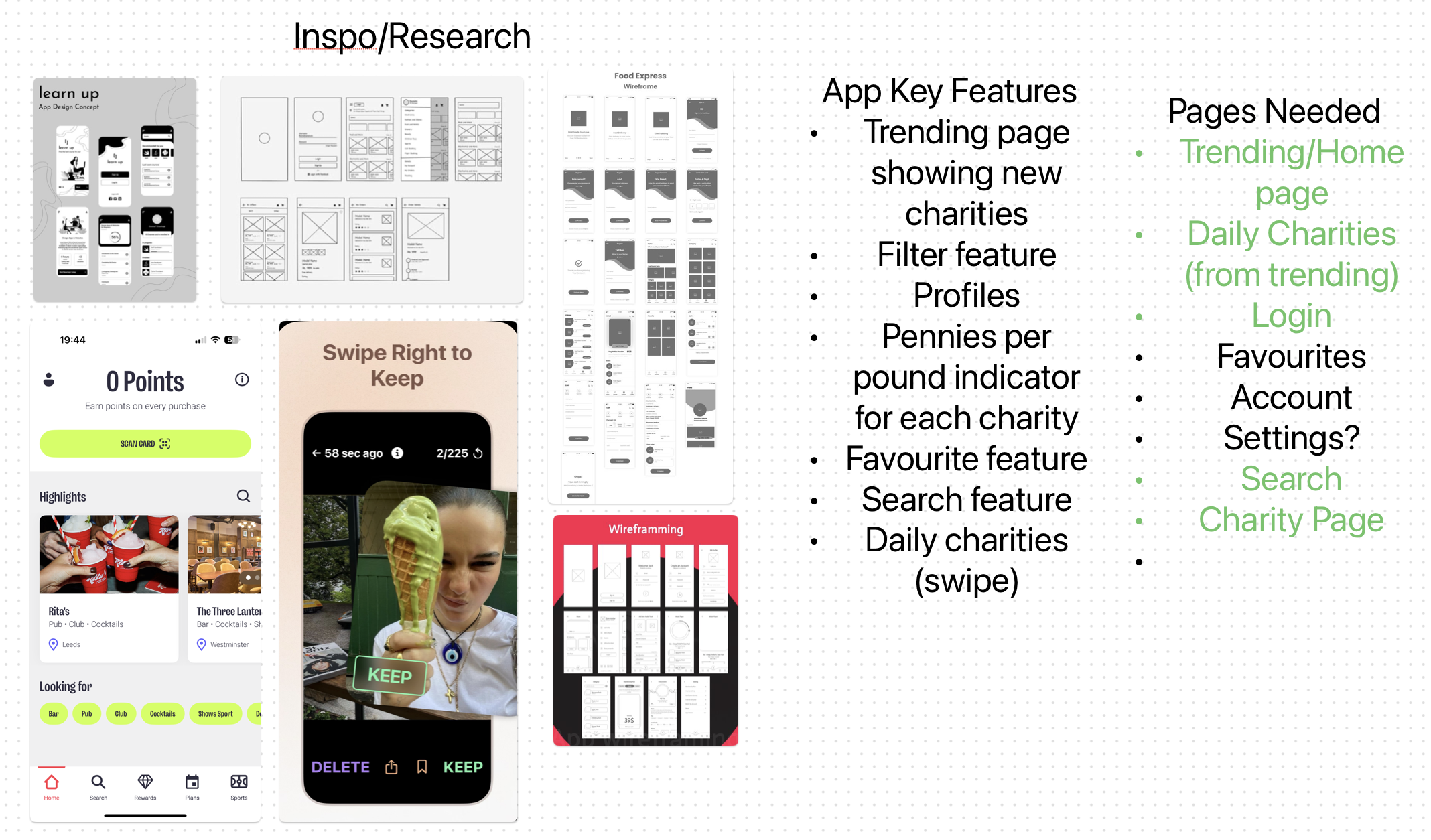
The final part of my mind-map consisted of reference images to inspire the different parts of the app. These images helped to influence the colour palette, as well as the style. One feature I wanted to implement into my app was Tinder’s swiping feature, where you can swipe to accept or deny a subject. In the context of the charity app, this would be used to learn more, or disregard daily charities that would be presented to the user. I wanted to add this feature because it gamified the concept, which would hopefully increase user engagement with the feature and provide a reason to come back to the app regularly.
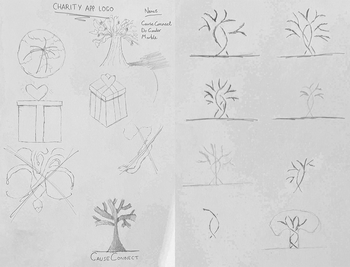
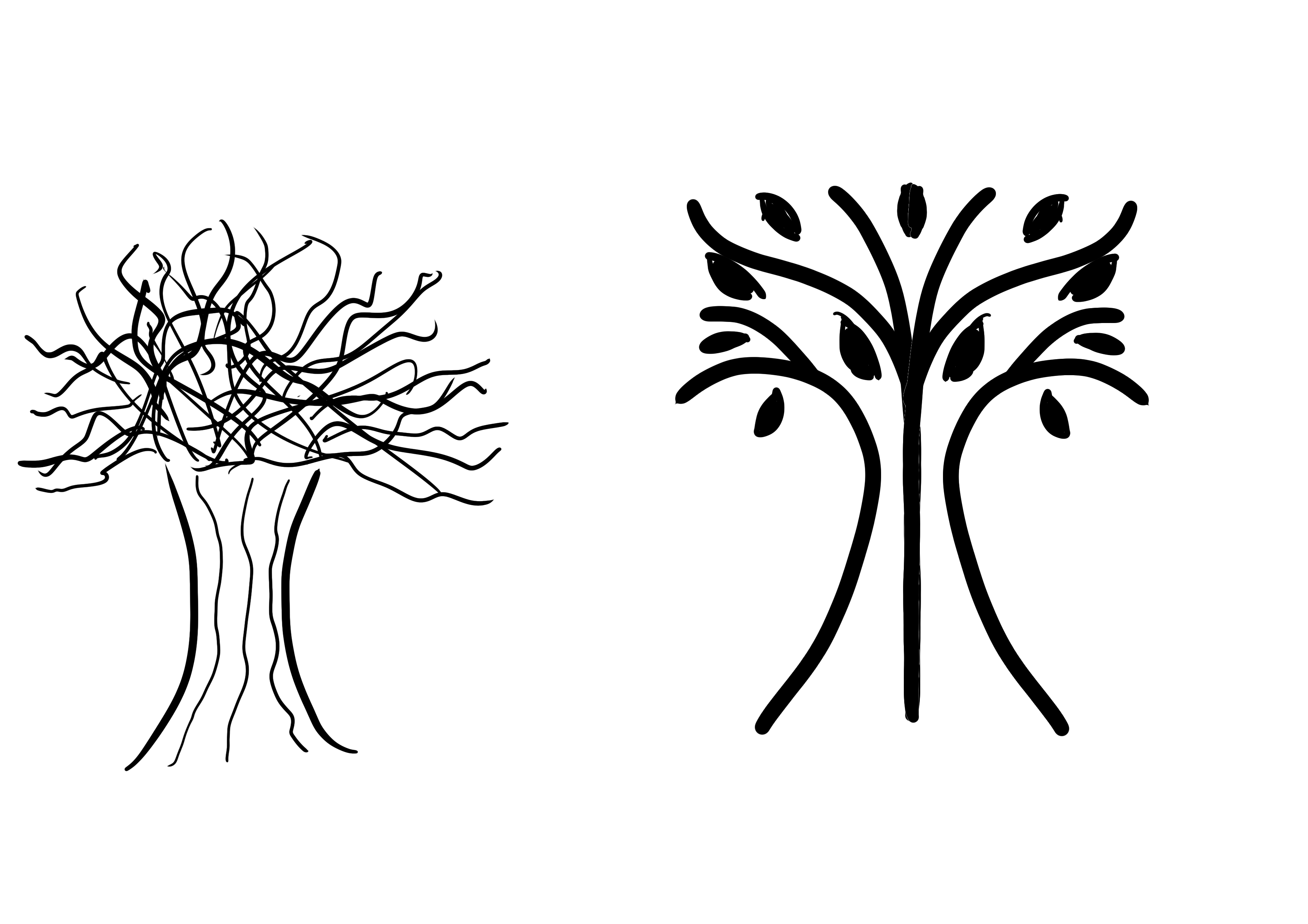
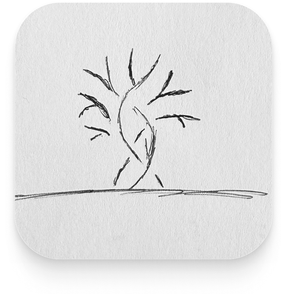
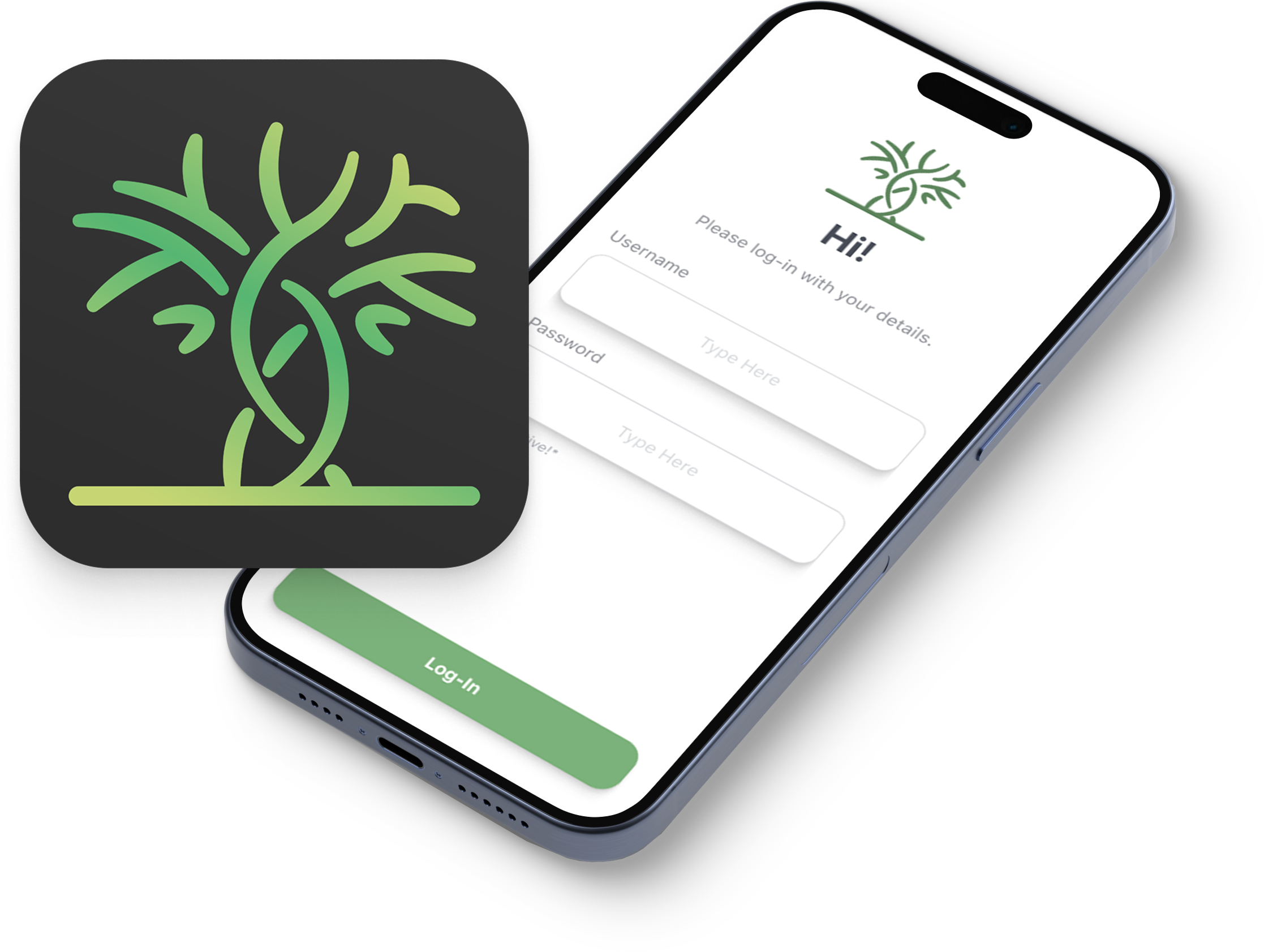
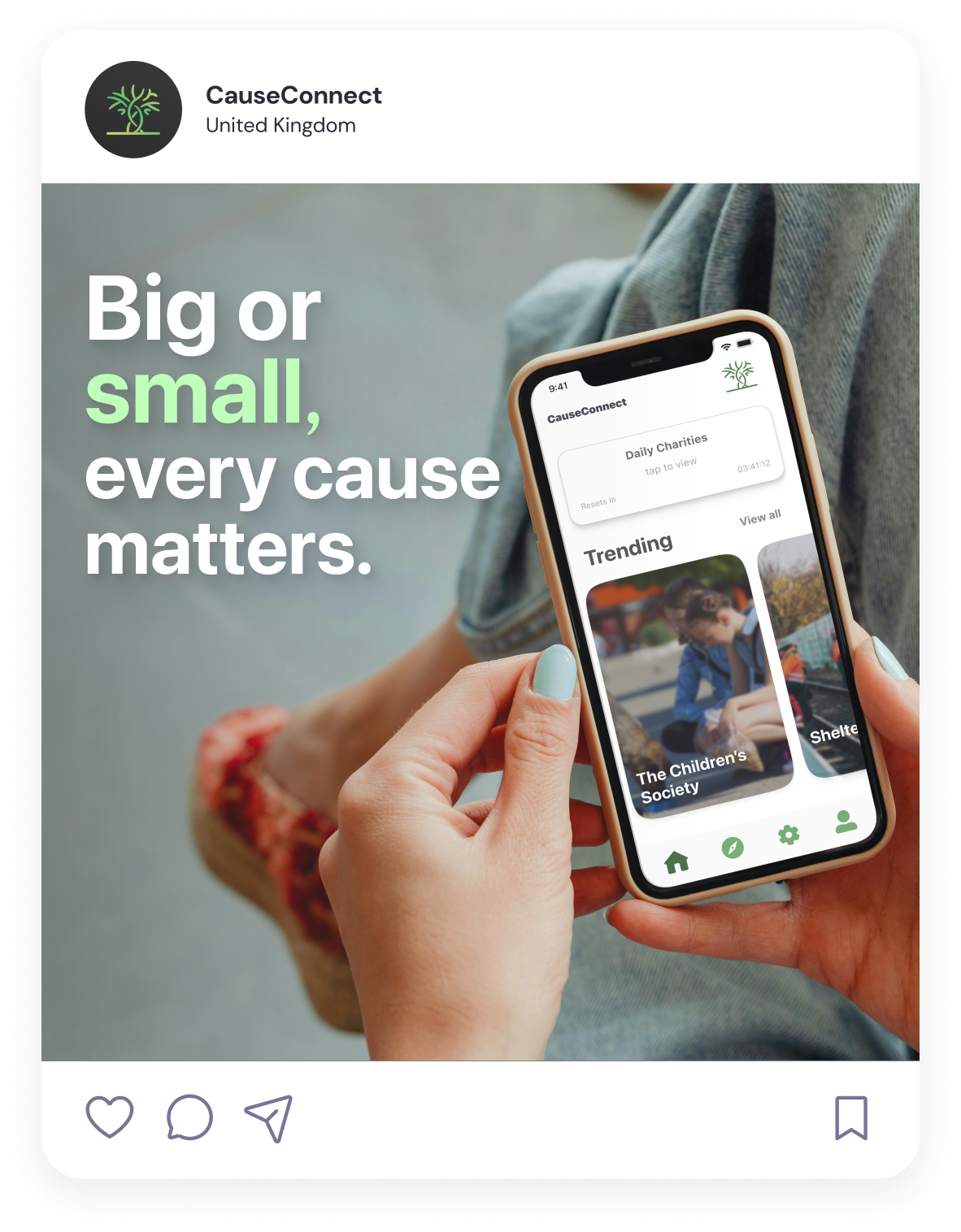
When it came to sketching, the first ideas I made were for the logo and app icon. I wanted the logo to emulate the purpose of the app, as this would make it easier for users to instantly understand what the app was while browsing. My first sketches consisted of present boxes, as this represented the act of giving. I decided not to use this idea however as the design didn’t fit the stylistic themes of the app. My second idea was a drawing of the earth, with lines stretching out to different countries across the globe. This idea was in relation to SDG-10, regarding the inequalities between countries. While I liked this idea, I didn’t use it as a result of its lack of readability. Finally, I decided the logo should be a tree, because the idea of nurturing something for it to grow was synonymous with the themes of charity, and the idea behind the app. I also decided the logo should include intertwining branches, to represent the connectivity of different charities working toward the same goal.
For the app design, I decided not to make sketches and instead instantly began producing basic iterations of the app digitally. The issue with this was that it prevented me from ideating efficiently, and exploring other ways in which I could have designed the layout of the app. The reason I did not make sketches is because I had a very clear idea in my mind and wanted to build the basic layout right away. In the future, I will sketch more ideas out first, since this will provide me with the opportunity to look at different types of designs objectively and decide which version would work best for the type of app I am attempting to create.
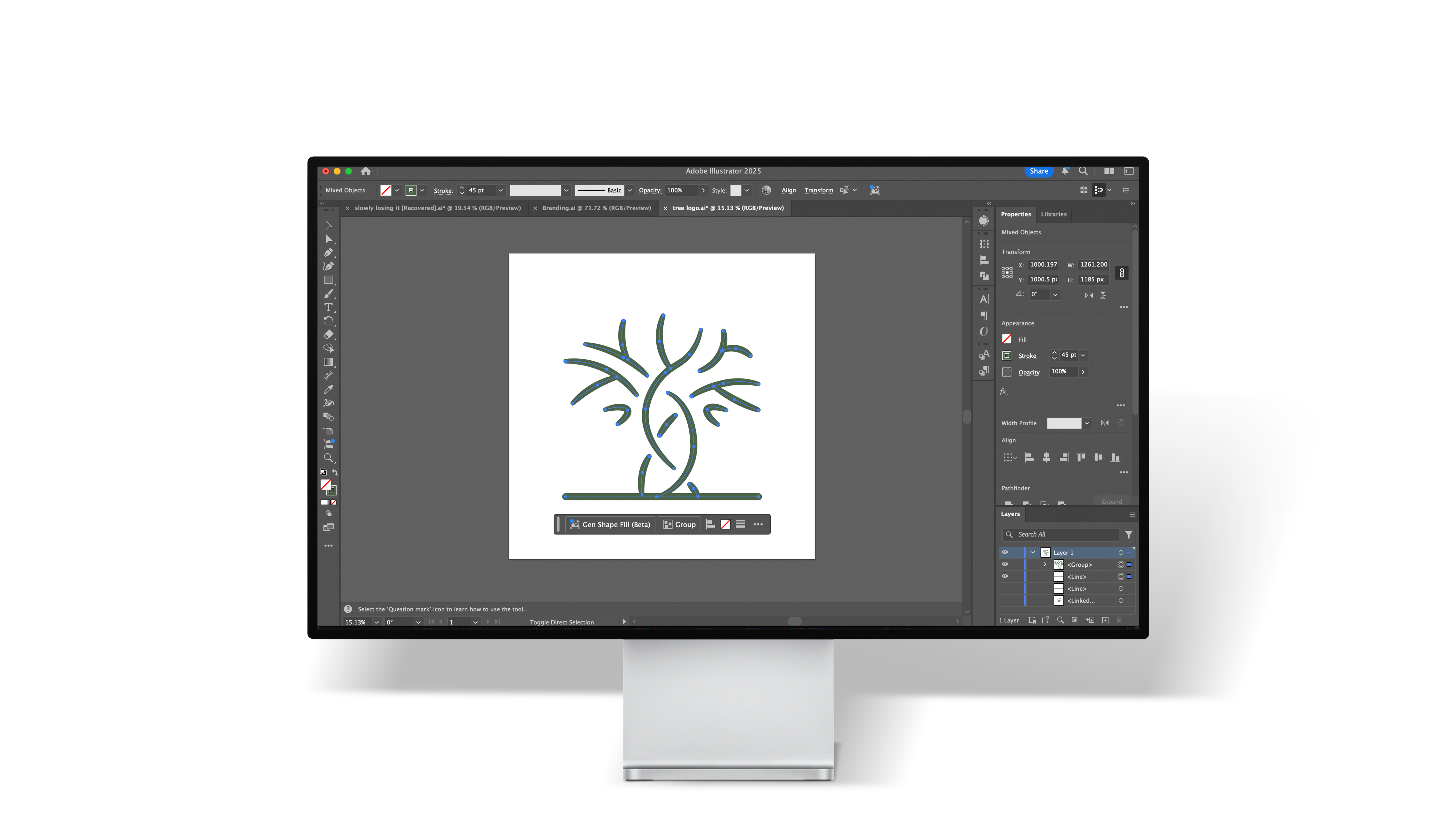
To create the logo, I decide to use Adobe illustrator, since its vector graphics tools are perfectly suited for crisp, readable logos. I started by importing my final sketch as a loose guide to follow, as this helped me to keep the proportions of the logo the same. After making the shape with the pen tool, I decided to use the width tool to accentuate the mid-point of each branch, to give the logo more character. This was to make the app more enticing to click on, by making it look less corporate and more user friendly. To use the logo as an app icon, I made the background a dark subtle gradient, to ensure the design stood out on the page.
From the beginning of development, it was vital to consider responsive design. By considering this from the start, it enabled me to resize the layout of each app page to any device dimension, while maintaining the proportions and alignment of each element. To achieve responsive design for the app, I used Figma’s native constraint and auto-layout tools, which logically resize and position the elements in the frame when it is resized. Given that users will be able to access the app via a multitude of different phones with varying screen sizes, this is especially important in order to maintain the accessibility and usability of the app.


The first versions of the app I made were simple black and white versions that focused on designing the layout of each page. I decided to create these versions first so that I considered the user-experience of each page and ensured that the whole app was consistent and easy-to-use. The next part of the process was creating a colour palette to use that aligned with the themes of the app. Since the logo I had created was a tree, I chose to use a light green as my primary colour. As well as this, Ahmad (2024) reinforces the fact that this colour works well for this project, due to green’s typical connotations of peace, nature, and mental health, all of which are common topics of charities. When implementing this colour into my UX design, I created a colour palette of varying greens, that scaled from 1-7 based on vibrance and brightness (I also did this for greys). I chose to implement this system so that I could easily maintain that the same types of elements in the app should follow the same colour palette. It was important to ensure this because it kept the app visually consistent, as well as making the layout look more professional.
To make a working version of the app, I used Figma’s native prototyping tools. Firstly, I created transitions through the buttons and added an ease-in fade to the animation. This was to make the switch between pages less abrupt and feel smoother for a better experience when using the app. In the settings I had added a feature that would switch the colours from light to dark mode, to make it easier to read for those that were visually impaired. This feature was important to include to ensure the app was accessible for all, in line with SDG-10 (reducing inequalities). After this, I began to work on the log-in system for the app, that simulated how users would need to enter a username and password to enter the app. I started to develop this by using a tutorial I found online.
At this point I ran into a major issue with the development of the app, that stemmed from the fact that the free version of Figma has limited capabilities. Typically, to develop a feature in Figma’s prototyping tools you require multiple variables for one element, but the free version of Figma does not allow more than one. Unfortunately, this ultimately prohibited me from developing multiple features in the app to the extent that I desired. As I did not discover this was an issue during my initial research, I was unable to switch to a different method of development at this late stage in the project.
With the benefit of foresight, I would have looked for an alternative means of prototyping the app, to better portray how the final version would have functioned. Despite this, I developed each feature of the app to my best ability and have created proof of concepts via the Adobe suite in lieu of working versions wherever applicable. An example of this was the search function, that would allow the user to filter their results based on category of charity, location and more. As I could not develop this, I created a mock-up version of the menu.
As an addition to the project, I decided to create a social media post that promoted the app. The primary aim of creating this post was to improve my ability to produce creative typography. As a slogan for CauseConnect, “big or small, every cause matters” contained key words that I could use to play around with. I used a different colour for the word ‘small’ because the main objective of the app is to promote lesser-known charities, and the choice to accentuate this word reflects that. I decided to use the font ‘SF-Pro’ to reflect the font used within the app, and because it is easy to read at a glance.
As this project required me to develop an app (something I hadn’t done before), I saw an opportunity to develop some new skills that would be valuable for work I would create in the future. Figma is an app that is constantly releasing innovative updates and features that are quickly making it one of the most vital applications to master. Consequently, it was imperative for me to utilise Figma to develop the charity app. While I had previously used Figma to design user interfaces for websites and the like, I had not used the prototyping tools that take proof of concepts to the next level. As well as this, Figma’s infrastructure allows for these designs to be instantly transferred into other software (such as Visual Studio) without any adjustments. Since I did not have the paid version of the app, I was unable to develop the features of the charity app to the extent I would have liked, but regardless I learnt how to use the tools for future projects. I also continued to develop my abilities within Adobe Illustrator, as this software is a staple for vector-based design. Through incorporating Illustrator into my workflow, I have been able to create sharper and cleaner logos. Creating logos via vector-based software is important, as logos need to be readable at varying sizes.
While there are many platforms that host a library of charities, my app fills a gap in the industry where smaller, localized charities are prioritized. Most charity directories that exist currently feature larger, well-established charities to validate the legitimacy of their tool. However, my app focuses on more specific, grassroots organisations in order to reduce inequalities in the sector (in line with the goals of SDG 10). Due to a lack of resources and digital outreach, providing these smaller charities with a platform gives them an opportunity to attract donors that they would not typically have access to.
Another advantage my charity app has over competitors is its focus on user-centred design. Many competitors for the app operate exclusively through web-based services, despite the fact that the vast majority of customers use mobile phones. The interface for my charity app utilises an intuitive and responsive design that is perfectly tailored for all mobile devices, to cater to that target audience. My key competitor for CauseConnect is Toucan Giving, another app that provides a centralized platform for users to donate to charities. One notable feature of this competitor is that it offers users a few questions upon launch to tailor their choices of charities to fit their interests. My app differs from this by instead offering daily charities that are hand-picked and will vary the types of causes. This feature fits the ethos of the app I am attempting to create, as it targets the aim of inclusivity and equality by promoting different types of charities that users may not be aware of. This feature also has the added advantage of gamifying the app by enticing viewers to swipe through their daily charities (akin to Tinder), and thus consistently bringing them back to the app. Adversely, Toucan Giving’s questionnaire feature reduces the scope of charities presented to the user from the get go, which could inhibit potential donations for under-represented charities.
In the future, I would like to include one feature that is similar to Toucan Giving, which is a page in the app that provides generalised statistics on the charities that the user is donating to and providing them a type of portfolio to measure how their donations are making change. I would also like to add a feature that would allow users to setup monthly payments to charities, as this would increase ease-of-use and provide some autonomy. Together, these features would strengthen the accessibility of the app and deliver a wide range of features that all cohesively work towards an effective and well-thought-out user experience.
As this project had no client, there was no requirement for communication and feedback to fit their brief. However, I did communicate with peers and my lecturer in order to gain a different perspective on the look of the designs, as well as many potential features of the app I may have overlooked. During my initial ideation for the app, my lecturer noted I could add a feature that displayed info on what percentage of any donations made went directly to the cause. This feature contributes to the overall goal of keeping the app completely transparent and would help users to choose between charities that are working toward the same cause. I could also present the progress of the app development at regular intervals to my peers, so that I can get a second opinion on specific design choices I had made. This was to mitigate the issue that without additional insight, I could miss glaring issues and obvious effective design choices.
One area of the project that went particularly well was my ideation and research phase. As I approached the project with a different methodology than usual, I was able to focus and spend more time on collecting information behind my idea. This included discovering potential pitfalls I may discover, key gaps in the market that I could fill, and finding common design choices relating to similar apps that could be implemented into my user interface. By researching more heavily, I could sufficiently prepare for the practical stage of the project and plan for any problems I may have run into. Despite this, the beginning of the design stage could have been improved by gathering feedback earlier on in the project, as well as iterative testing throughout. This could be achieved by issuing surveys on particular design choices that would highlight any potential pain-points in navigation within the app, or potential issues with accessibility or ease-of-use. Additionally, I could have utilised A/B testing, that would present testers with two different designs that they could choose between. This would have been beneficial as it would have prohibited me from narrowing the design choices I had made too early in the project.
Another strength of the project was the branding for the app. From the start, my intention was to create a design that was cohesive and recognisable. By prototyping many different logo designs during the sketching phase, and researching common themes behind charity, I was able to settle on the tree logo that adequately spoke to the overall design of the app. As well as this, I gained more experience in Adobe Illustrator through the project, which is an app I am constantly trying to improve my abilities for. Most notably, the area of the process that did not go as well as planned was the development stage. The main reason for this is that I was unable to prototype the app to the extent I desired, as Figma locks the bulk of their coding features behind a paywall. As I discovered this at a late stage in the project, there was not enough time to change my method of development or fix the issue. However, this issue could have been rectified had I allocated more time as a contingency in the event of a problem such as this occurring.
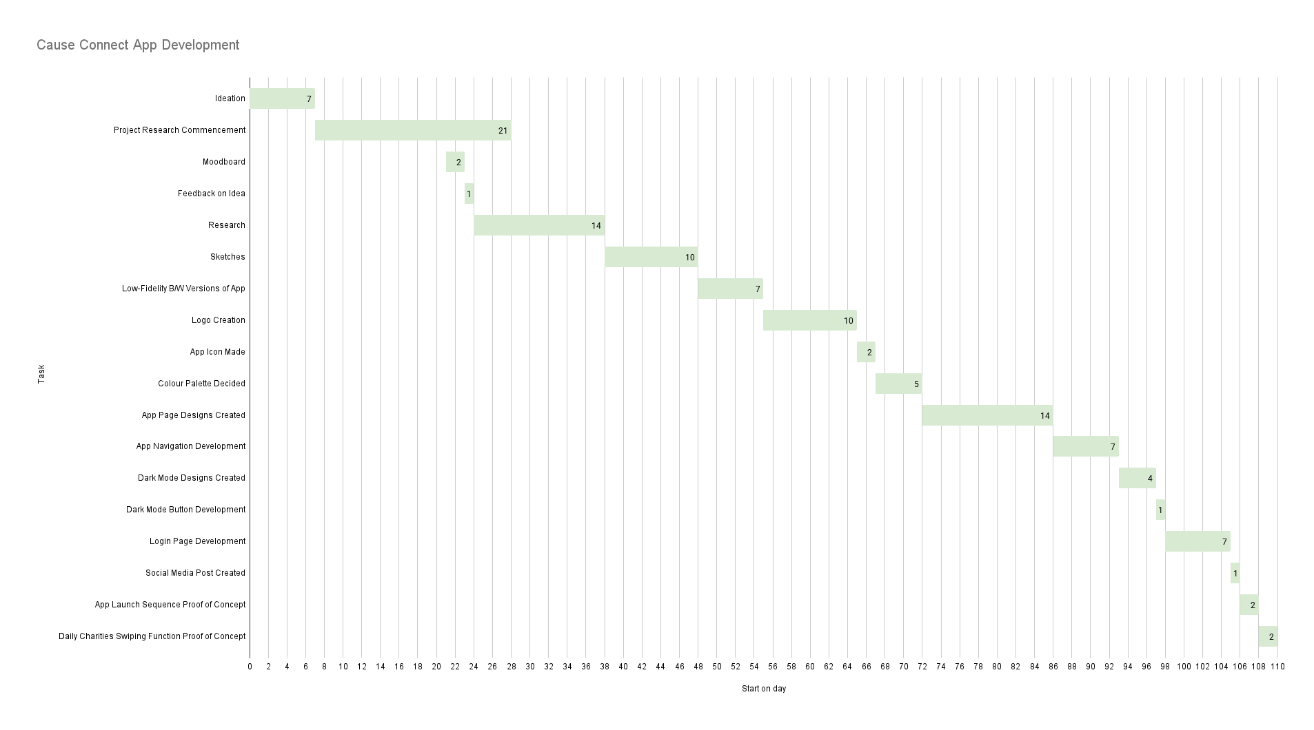
Throughout the project, my time management was essential to keeping me on track and completing each stage of the app on time. A specific way I managed my time was by setting daily goals, so that I could break the designs into more manageable chunks and did not overwhelm myself with the scope of the entire project at once. This structure allowed me to monitor my progress, and plan for any issues I ran into by allocating more time to a specific step in the process, as well as adjusting the rest of the schedule accordingly. This also helped me to maintain progress with my other university projects simultaneously, so that I did not fall behind and prevented fatigue from working on the same thing for too long. By planning to work on different projects a little at a time, I could keep my perspective fresh, which helped me to look at the designs I was creating more objectively. However, due to my linear workflow and not allocating enough time to problem solving, I did run into issues with the development of the project in the later stages. As a result, I could not implement all the features into the app that I wished to. To address this, I intend to conduct post-project development, that would allow me to create a more functional prototype of the app. However, despite this setback towards the end of the project, my structured approach to time management proved a major contribution to delivering a proof-of-concept for the charity app.
Overall, the aim of this project was to solve an issue in the charity sector, where smaller charities lacked the resources and promotional budget to contend with well-established, larger organizations that dominate the industry. To fix this, I set out to create a working prototype of an app (CauseConnect) that focused on highlighting these smaller charities and providing them with a platform to reach potential donors. I consider this project to be successful, as the app I have created fits this brief and acts as a mock-up model that can be developed on further in the future. While I ran into issues with time management towards the end of the project due to the unexpected paywall in Figma, I was able to provide proof-of-concepts for features I would like to have developed. Examples of these are the search function, that would have allowed users to filter their search results to fit their specific needs, and the daily charity swiping function.
A core aim of this project was to align with the goals of SDG10, which is centred around reducing inequalities and increasing inclusivity. This was achieved through the charity app by promoting underappreciated charities, as well as focusing on a user-centred design that ensured accessibility. I also aimed to showcase UI and UX principles through well thought out design, in order to maximise ease-of-use. This was achieved through appraising other app designs during my research phase, so that I could explore common design choices that consistently work towards accessible design. Additionally, adding a light/dark theme made the app more customisable, so that users can tailor the interface to their preferences. This also aligns with Apple’s design principles, providing a sense of cohesion and making the app appear more professional.
A major goal of the project was to brand the app in a way that fit the themes of charity. I achieved this through heavy iterative design of the logo, to ensure the tree I created represented the core aims of charitable giving. Namely, including intertwining branches into the design to emulate the connectivity charity provides. I also utilised a green colour palette in both the app icon and the app interface, due to its connotations of nature and peace. A personal goal in this project was to further develop my skills in Adobe Illustrator and Figma, which I managed to achieve through extensive testing and exploring different tools within the software. It is valuable to constantly strive to improve within the design software I use, to avoid becoming complacent and relying on outdated design methods. The creative industry is constantly being shaped by new innovative methods of design, such as the large strides in generative AI. Utilising these new tools was essential to the success of the project, due to the time they save, and the advantage they provided me over competitors relying on older design methods.
Ahmad, S. (2024) The Psychology of Colors in UX/UI Design. Medium. Available at:
https://medium.com/design-bootcamp/the-psychology-of-colors-in-ux-ui-design-e66eabe40799
Centre for Social Justice Foundation (2024) Underfunded and Overlooked. Available at:
https://www.centreforsocialjustice.org.uk/wp-content/uploads/2024/05/CSJF-Overlooked_and_Underfunded.pdf
Charity Commission (n.d.) Find charity information. GOV.UK. Available at:
https://www.gov.uk/find-charity-information
Figma (n.d.) Release Notes. Available at:
https://www.figma.com/release-notes/
Good Things Foundation (n.d.) Helping people improve their lives through digital. Available at:
https://www.goodthingsfoundation.org
Joseph Rowntree Foundation (2024) AI for public good: Grassroots and non-profit perspectives on generative AI. Available at:
https://www.jrf.org.uk/ai-for-public-good/grassroots-and-non-profit-perspectives-on-generative-ai
Link, C. (2023) The reasons people give to charity. Charity Link. Available at:
https://www.charitylink.net/blog/reasons-people-give-to-charity
NPC - New Philanthropy Capital (2023) Why funders need to champion small charities. Available at:
https://www.thinknpc.org/blog/why-funders-need-to-champion-small-charities
RSM UK (2024) Stemming the tide – common types of fraud in the charity sector. Available at:
https://www.rsmuk.com/insights/charity-trustee-insights/fraud-in-the-charity-sector
Shopify (n.d.) Virtue - Charity Donations. Available at:
https://apps.shopify.com/virtue
The Donation App (n.d.) The Donation App. Available at:
https://www.thedonationapp.com/
The Open University (2018) The Value of Small: Research into the distinctive contribution, value and experiences of small and medium-sized charities in England and Wales. Available at:
https://university.open.ac.uk/centres/voluntary-sector-leadership/sites/www.open.ac.uk.centres.voluntary-sector-leadership/files/files/the-value-of-small.pdf
Toucan Giving (n.d.) The Toucan App. Available at:
https://thetoucan.app
United Nations (n.d.) Goal 10: Reduced Inequality. UN Sustainable Development Goals. Available at:
https://sdgs.un.org/goals/goal10
Van Der Heijden, H. (2012) ‘Small is beautiful? Financial efficiency of small fundraising charities’, The British Accounting Review, 45(1), pp. 50–57. Available at:
https://doi.org/10.1016/j.bar.2012.12.004
YouTube (n.d.) Figma login prototype tutorial. Available at:
https://www.youtube.com/watch?v=obVCF-RFmr0&t=1944s